Leonetto Cappiello: The Father of Modern Advertising Poster
Leonetto Cappiello (1875 – 1942) was an Italian poster artist who lived much of his life in Paris, France. With no formal training in art, he emerged as one of the leading Italian artist and caricaturist in Paris that eventually succeeded the other famous lithographers such as Henri Toulouse-Lautrec (1864-1901), Jules Cheret (1836-1932) and Alphonse Mucha (1860-1939) as the leading advertising poster designer in Paris.
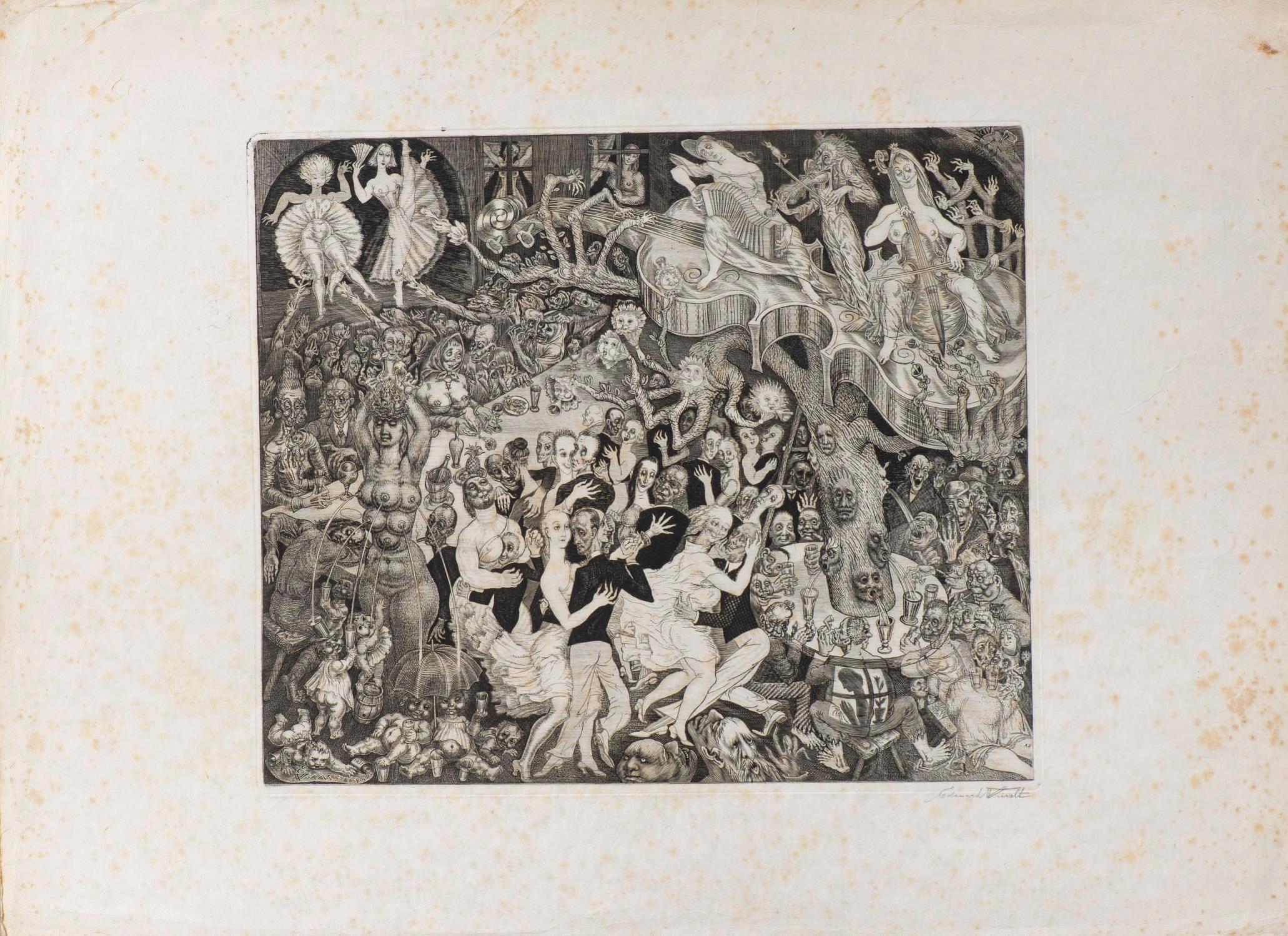
Talented Cappiello started his arts career as a caricature artist in 1896 illustrating for French journals like Le Rire, Le Cri de Paris, Le Sourire, L’Assiette au Beurre, La Baionnette, Femina, and others. His first album of caricatures, Lanterna Magica, was made in 1896. His early caricature style was seen to be influenced by Henri Toulouse-Lautrec, which was already the most famous artist of the time.
Today, arts historians list him as one of the most influential poster artist in the history of poster art as many would agree that he is also known as the “Father of Modern Advertising Poster”. As advertising posters were the main medium of communication during the time, Paris streets were saturated with many types of advertising posters, all trying hard to engage the increasingly distracted eyes. There was a need to rethink how poster as a medium need to be relevant and engage the faster pace of the 20th century.

The Cappiello Style
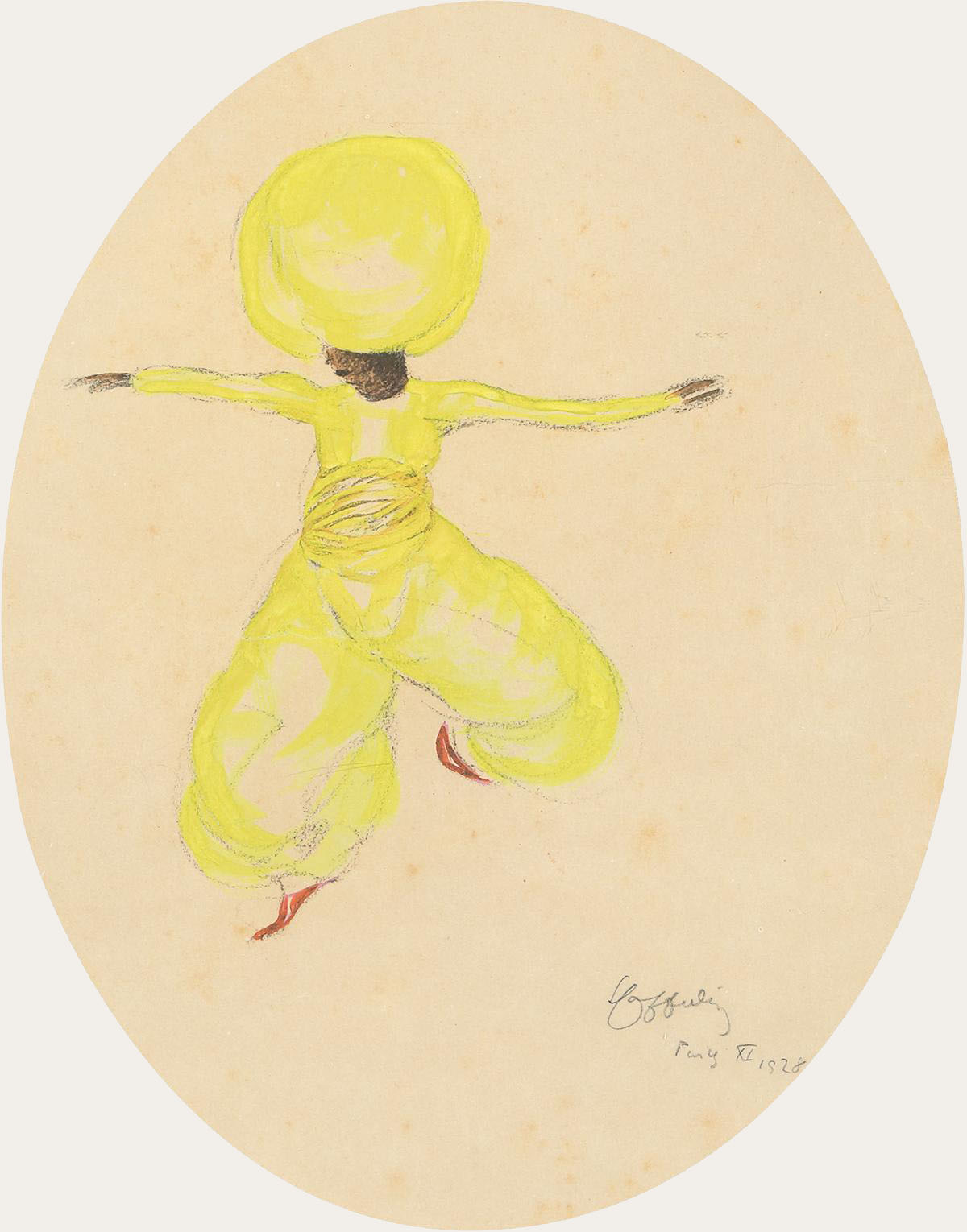
Cappiello is credited to revolutionize the old thinking of poster illustration during his time. His concept of poster art was simple, to simply engage audience faster by creating unconventional visual impact. He was the first poster artist to boldly experiment and innovate new graphical styles at the time. His presentation was straight forward with use of enlarged bold subjects with unconventional colors,contrasted by the very dark background, which make his art “pop out”. By doing so he moved away from illustrating intricate details in his artworks, which was famous at the time as Art Nouveau movement was popular.
Between 1901 and 1914, he created several hundred posters in a style that revolutionized the art of poster design. Cappiello redesigned the fin-de-siècle pictures into images more relevant to the faster pace of the 20th century.
His new functionalist style of graphic art, in which a single bold image would be used to grab the viewer’s attention. This graphic design proved highly effective, not only in drawing attention to the product but also in building a brand. It made Cappiello the acknowledged master of the advertising poster in his time for almost 20 years. | src RetroGraphik