Leonetto Cappiello (1875-1942) ~ A dancer in motion wearing a futuristic headpiece and billowing wide pants, 1928. Watercolor and pencil drawing | src invaluableLeonetto Cappiello (1875-1942) ~ Folies Bergere poster, 1900s | src RetroGraphik
Leonetto Cappiello: The Father of Modern Advertising Poster
Leonetto Cappiello (1875 – 1942) was an Italian poster artist who lived much of his life in Paris, France. With no formal training in art, he emerged as one of the leading Italian artist and caricaturist in Paris that eventually succeeded the other famous lithographers such as Henri Toulouse-Lautrec (1864-1901), Jules Cheret (1836-1932) and Alphonse Mucha (1860-1939) as the leading advertising poster designer in Paris.
Talented Cappiello started his arts career as a caricature artist in 1896 illustrating for French journals like Le Rire, Le Cri de Paris, Le Sourire, L’Assiette au Beurre, La Baionnette, Femina, and others. His first album of caricatures, Lanterna Magica, was made in 1896. His early caricature style was seen to be influenced by Henri Toulouse-Lautrec, which was already the most famous artist of the time.
Today, arts historians list him as one of the most influential poster artist in the history of poster art as many would agree that he is also known as the “Father of Modern Advertising Poster”. As advertising posters were the main medium of communication during the time, Paris streets were saturated with many types of advertising posters, all trying hard to engage the increasingly distracted eyes. There was a need to rethink how poster as a medium need to be relevant and engage the faster pace of the 20th century.
Leonetto Cappiello (1875-1942) ~ Turbaned dancer in midair wearing a bright yellow outfit, 1928. Watercolor and charcoal drawing | src invaluableLeonetto Cappiello (1875-1942) ~ Asti Cinzano poster, 1910s | src RetroGraphik
The Cappiello Style
Cappiello is credited to revolutionize the old thinking of poster illustration during his time. His concept of poster art was simple, to simply engage audience faster by creating unconventional visual impact. He was the first poster artist to boldly experiment and innovate new graphical styles at the time. His presentation was straight forward with use of enlarged bold subjects with unconventional colors,contrasted by the very dark background, which make his art “pop out”. By doing so he moved away from illustrating intricate details in his artworks, which was famous at the time as Art Nouveau movement was popular.
Between 1901 and 1914, he created several hundred posters in a style that revolutionized the art of poster design. Cappiello redesigned the fin-de-siècle pictures into images more relevant to the faster pace of the 20th century.
His new functionalist style of graphic art, in which a single bold image would be used to grab the viewer’s attention. This graphic design proved highly effective, not only in drawing attention to the product but also in building a brand. It made Cappiello the acknowledged master of the advertising poster in his time for almost 20 years. | src RetroGraphik
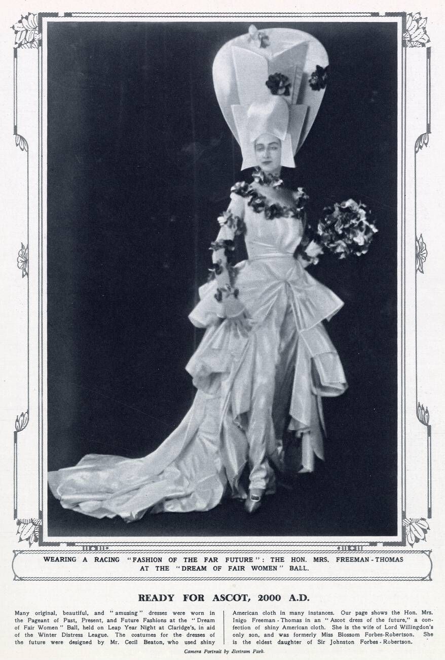
The Pageant of Past, Present and Future Fashions was held on 29th February 1928 (Leap Year Night) at Claridge’s (London) in aid of the Winter Distress League. The costumes for the dresses of the (far) future were designed by Cecil Beaton. The image above shows Ms. Freeman-Thomas in an outfit titled ‘The Ascot Dress of the Future’.
Detail from Mrs Freeman-Thomas by Cecil Beaton (formerly Miss Blossom Forbes-Robertson), 1928
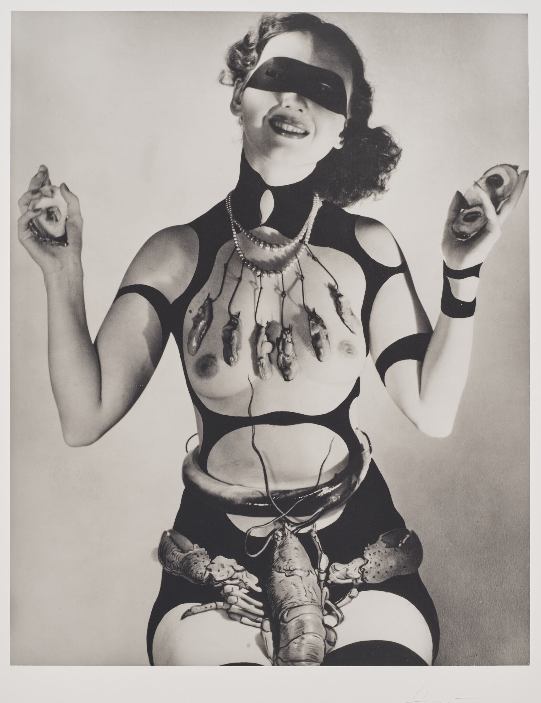
Horst P. Horst (1906–1999) ~ Costume design by Salvador Dali for ‘Dream of Venus’, 1939 | src Christie’sHorst P. Horst (1906–1999) ~ Costume design by Salvador Dalí for ‘Dream of Venus’ (Lobster # 1), 1939 | src Christie’s
In June 1939 Salvador Dalí designed a pavilion for the New York World’s Fair built by the architect Ian Woodner. The building was named Dream of Venus.
The pavilion featured a spectacular facade full of protuberances, vaguely reminiscent of the Pedrera building by Antoni Gaudí. The main door was flanked by two pillars representing two female legs wearing stockings and high-heeled shoes. Through the openings of the irregular façade, visitors could see reproductions of the Saint John the Baptist by Leonardo da Vinci and The Birth of Venus by Botticelli. The outer part of the building also had crutches, cacti, hedgehogs, etc. Inside, the pavilion offered visitors an aquatic dance show in two large swimming pools, with sirens and other items also designed by Dalí, some of them taking their inspiration from the work of Bracelli. Between the painter’s initial ideas and the final result of the project there arose major modifications, which led Dalí to complain about the Fair’s requirements in a pamphlet entitled Declaration of the Independence of the Imagination and the Rights of Man to His Own Madness. […] [quoted from dali.org]
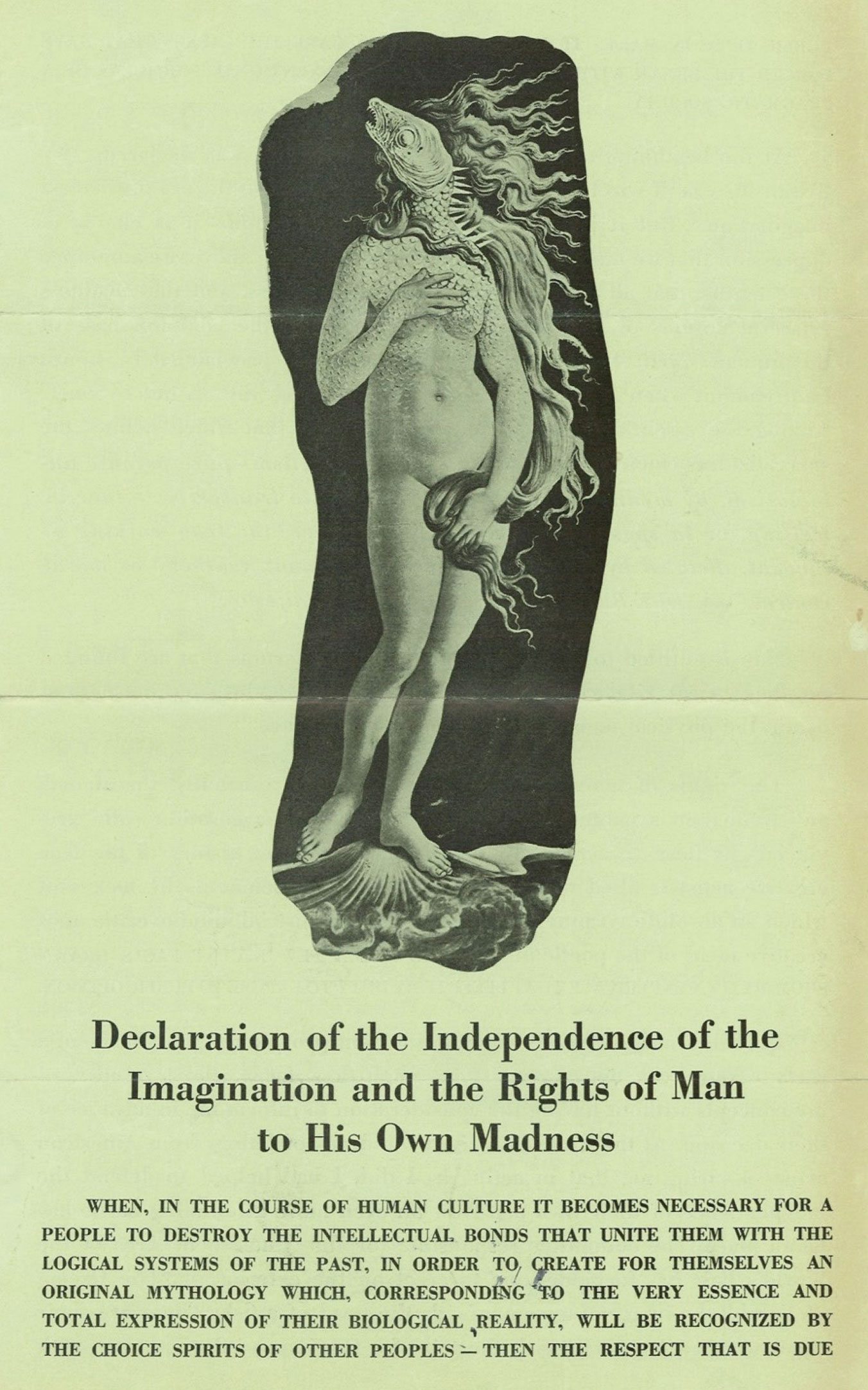
Salvador Dalí (1904 – 1989) ~ Declaration of the Independence of the Imagination and the Rights of Man to His Own Madness, 1939, ink on paper | src National Art Library; also AIC
Salvador Dalí wrote this declaration after his experience creating a pavilion for the 1939 New York World’s fair. The ‘Dream of Venus’ pavilion was a Surrealist undersea grotto where semi naked women performed in tanks playing piano and milking cows amongst other suitably surreal activities. The image on this pamphlet of Botticelli’s Venus with the head of a fish was Dalí’s original idea for the Pavilion’s entrance. However, the design was rejected by the Fair’s organizers who stated “‘A woman with the head of a fish is impossible” and replaced it with a simple reproduction of Venus. Believing that his artistic vision had been unacceptably compromised, Dalí responded by producing this pamphlet berating the Fair’s organizers and rallying against mediocrity in art by consensus. [quoted from V&A museum]
Julien Levy ~ Facade of the pavilion “Dream of Venus” conceived by Salvador Dalí for the New York World Fair (1939) | src AIC
[…] Despite the conflicts that derived from Dalí’s collaboration with the organizers of the Fair, his participation has to be rated as a highly important moment within the painter’s increasing approximation to mass culture, and his need to project his ideas beyond the strict circles of artistic culture. In this sense it may not be exaggerated to state that The Dream of Venus was a first version (though with features and a context of its own) of that other enormous “inhabitable” and “visitable” artistic object that was to be the Dalí Theatre-Museum of Figueres many years later. [quoted from dali.org]
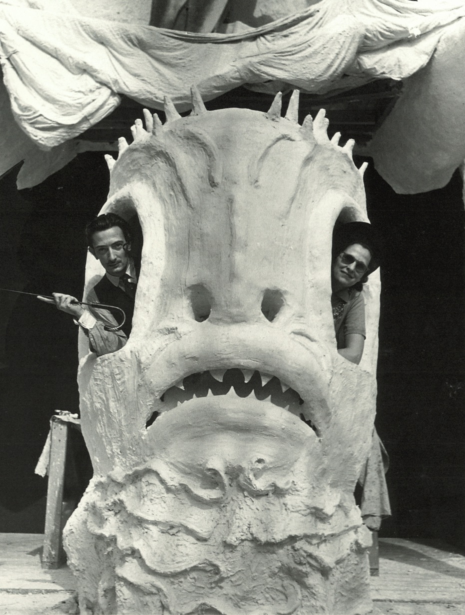
Gala and Dalí in the ticket booth of the pavilion “Dream of Venus” by Salvador Dalí for the New York World Fair (1939)Entrance of the pavilion “Dream of Venus” conceived by Salvador Dalí for the New York World Fair (1939)
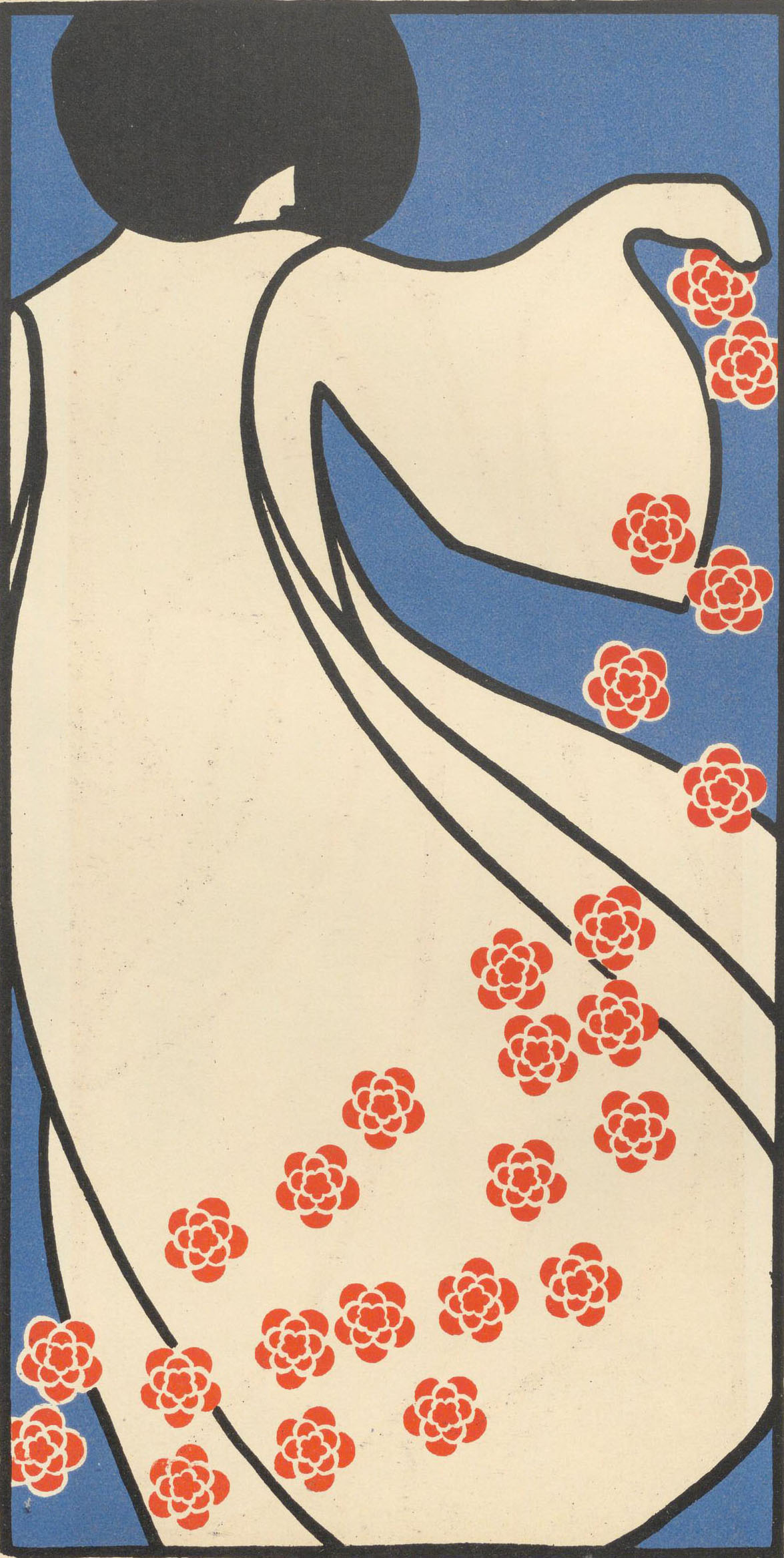
Plakatentwurf von Agnes Speyer Die Fläche Entwürfe für decorative Malerei, Placate, Buch- und Druckausstattung | src ÖNBPlakatentwurf von Agnes Speyer Die Fläche Entwürfe für decorative Malerei, Placate, Buch- und Druckausstattung | src ÖNB
A.M. Cassandre :: Poster for the Paris newspaper L’Intransigeant, designed by Cassandre, 1925. Printer: Hachard & Cie., Paris | src MoMA
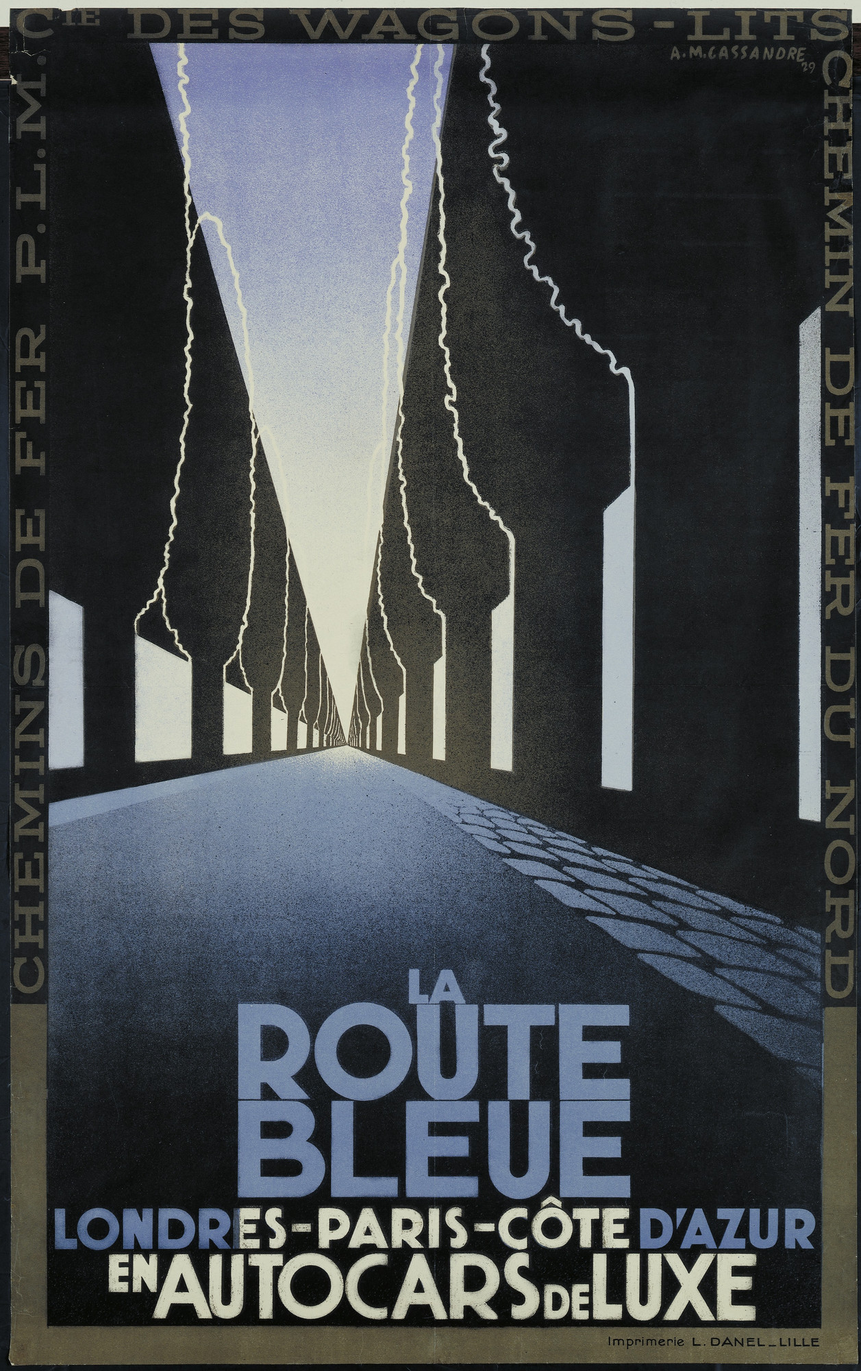
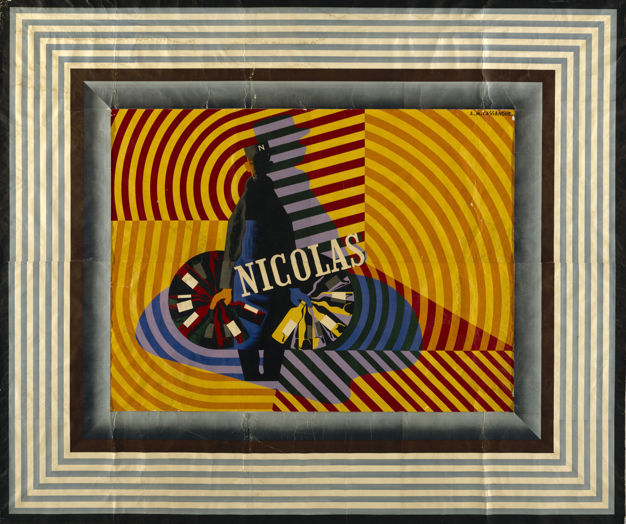
Cassandre (1901-1968) or A.M. Cassandre (the pseudonym of Adolphe-Jean-Marie Mouron) was a graphic artist, stage designer, and painter whose poster designs greatly influenced advertising art in the first half of the 20th century.
Cassandre used figurative geometry and modulated planes of colour, derived from Cubism, to revitalize postwar French poster design. From 1923 until 1936, Cassandre designed posters in which he reduced his subject matter to bold shapes and flat, modulated icons. He emphasized two-dimensional pattern, and he integrated lettering with his imagery to make a unified overall composition. Cassandre also utilized airbrushed blends and grading to soften rigid geometry.
A.M. Cassandre (Adolphe Mouron, 1901-1968) :: 1932 version of the “Dubonnet” poster. Alliance Graphique, Paris. | src Rennert Gallery
Cassandre gained a reputation with such posters as “Étoile du Nord” (1927) and “Dubo Dubon Dubonnet” (1932). The Dubonnet posters were among the earliest designed specifically to be seen from fast-moving vehicles, and they introduced the idea of the serial poster, a group of posters to be seen in rapid succession to convey a complete idea.
In 1926 Cassandre cofounded the advertising agency Alliance Graphique and soon turned his attention to experimental typography. He designed three typefaces: Bifur (1929), Acier Noir (1935) and Piegnot (1937). In 1939 he abandoned poster art and henceforth devoted himself to designing stage sets and to painting.
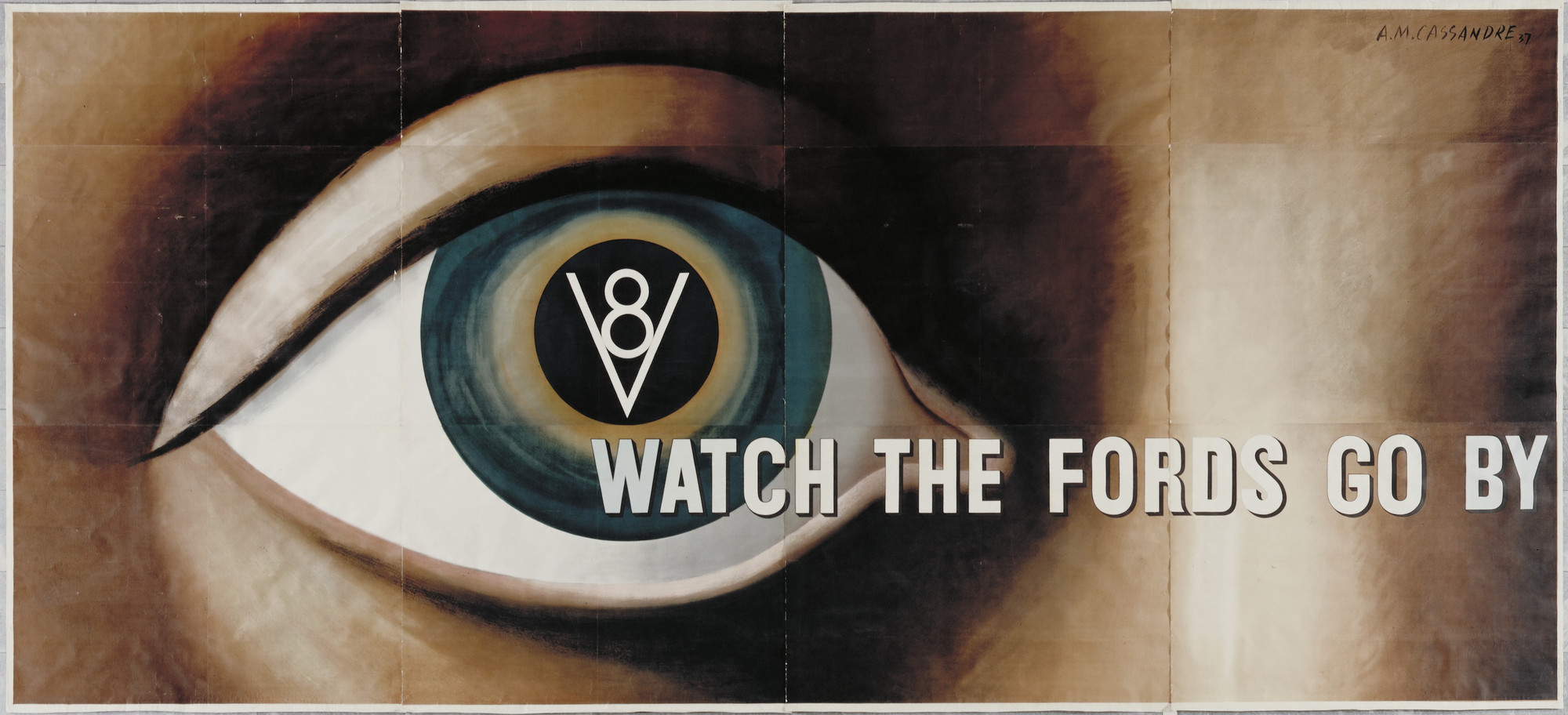
A.M. Cassandre :: Watch the Fords Go By (Poster for Ford Motor Company), 1935 | src MoMA
Ford was the first manufacturer to develop a V8 engine—previously associated with luxury and specialist cars—for a mass market. In employing Cassandre, Ford infused its corporate reputation for industrial innovation with the artistic cachet of European modernism. Cassandre was already established as a preeminent French poster designer and in 1936 he had become the first graphic artist to have a solo exhibition at MoMA. This compelling image of a disembodied, all-seeing eye is rooted in a classical tradition that emphasizes the primacy of vision in Western culture; the eye is also prevalent in Surrealist art of the 1920s. Trailing from the iris, the slogan “Watch the Fords Go By” gives a sense of modern vision, always in motion, while the V8 icon imprinted on the pupil suggests a fusion of mind, body, and technology—a synthesis that revolutionized individual perception in the modern world.
Gallery label from Shaping Modernity: Design 1880-1980, December 23, 2009–July 25, 2010 (MoMA)
A.M. Cassandre :: La Route Bleu, Londres-Paris-Côte d’Azur en Autocars de Luxe, 1929 | MoMAA.M. Cassandre :: Fêtes de Paris, 1935. | MoMAA.M. Cassandre :: Nicolas, 1935 | src MoMA
Exposition de la gravure japonaise du 25 avril au 22 mai… A l’Ecole des Beaux Arts… : [affiche] engraving [1890] Author / Auteur : Jules Chéret (1836-1932) Illustrateur | src BnF ~ GallicaExposition de la gravure japonaise du 25 avril au 22 mai… A l’Ecole des Beaux Arts… : [affiche] [1890] Author : Jules Chéret (1836-1932) Illustrateur | src BnF ~ Gallica
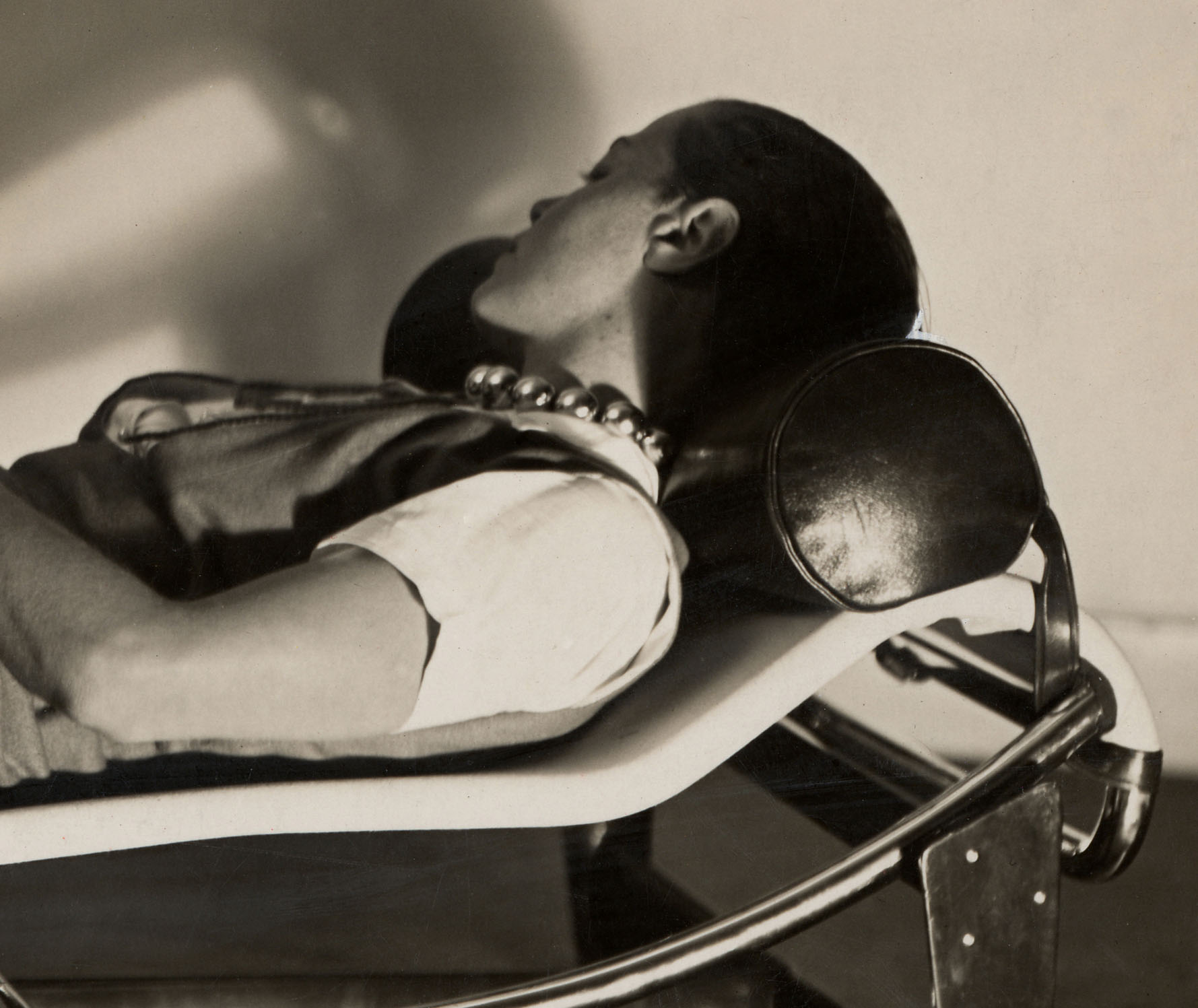
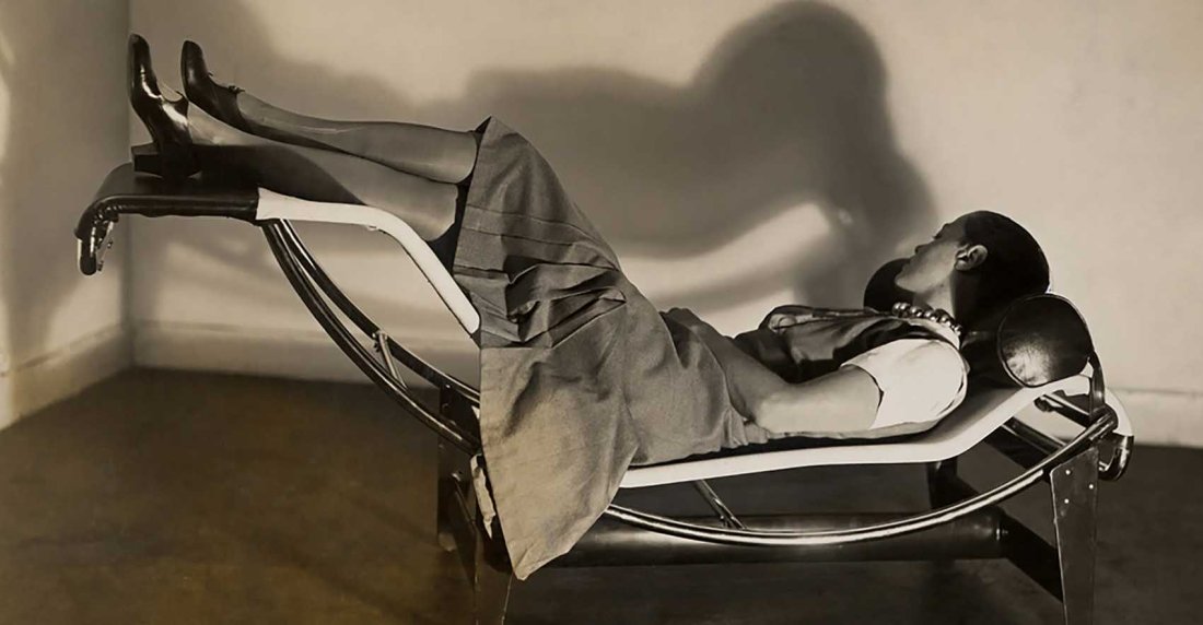
Charlotte Perriand’s ball-bearings necklace was exhibited in 2009 at the exhibition “Bijoux Art Deco et Avant Garde” at the Musee Des Arts Decoratifs in Paris and, in 2011, in the show “Charlotte Perriand 1903-99: From Photography to Interior Design” at the Petit Palais. The necklace became, for a short period, synonymous with Perriand and with her championing of the machine aesthetic in the late 1920s and has subsequently attained the status of a mythical object and symbol of the machine age. This essay considers the necklace as an object and symbol in the context of modernist aesthetics. It also discusses its role in the formation of Perriand’s identity in the late 1920s, when she was working with Le Corbusier, and aspects of gender and politics in the context of the wider modern movement. [more on Semantic Scholar]
Fernand Léger :: Still life, Le Mouvement à billes (1926). Gouache and ink on paper. Signed with initials and dated 26.
“I had a street urchin’s haircut and wore a necklace I made out of cheap chromed copper balls. I called it my ball-bearings necklace, a symbol of my adherence to the twentieth-century machine age. I was proud that my jewelry didn’t rival that of the Queen of England.”
Perriand had asked an artisan with a workshop in the Faubourg Saint-Antoine to make the piece out of lightweight chrome steel balls strung together on a cord. The piece was inspired by Fernand Léger’s still life “Le Mouvement à billes” (1926).
The necklace became a symbol of Perriand’s passion for the mechanical age […] (see also: Charlotte Perriand’s “Ball Bearings” Necklace on Irenebrination)
Fernand Léger :: Étude pour “Le Movement à billes” Signed with initials F.L. and dated 26(lower right). Gouache and ink on paper. | src Sotheby’s
“Art is in everything,” insisted Charlotte Perriand. […] When you see Charlotte’s chaise longue, chair, and tables in front of that immense Léger, you cannot imagine the design without the art—it is a global vision.
On an adjacent wall, Collier roulement à billes chromées (1927)—a silver choker made from automotive ball bearings that Perriand not only designed but wore—is placed next to a Léger painting, Nature morte (Le mouvement à billes) (Still life [Movement of ball bearings], 1926). [quoted from William Middleton review of the exhibition Charlotte Perriand: Inventing a New World, on Gagosian]
Charlotte Perriand in the Chaise longue basculante, B306 (1928, Le Corbusier, P. Jeanneret, C. Perriand) Photo: Courtesy of Louis Vuitton Foundation, ph. by Pierre Jeanneret. | src Architectural Digest
She recalls how in 1927 at the age of just 24 she marched into the studio of Le Corbusier in Paris and showed the master architect her designs in order to present herself as an architect. He looked at everything and then said, “Mademoiselle, we don’t embroider cushions here.” [src indion]
Charlotte Perriand on her famous Chaise Longue Basculante, which she designed with Le Corbusier and Pierre Jeanneret, 1929. Charlotte Perriand. Inventing a New World (2019-2020) at Fondation Louis Vuitton | image src Klat magazine
The young woman bathed confidently in the sparkling energy of the “années vingt”, learned the Charleston, admired Josephine Baker, wore her hair cropped short and had a necklace made of chrome-plated balls, which she called her “ball bearings” – a provocation of industrial aesthetics. Modernism was gathering momentum. In her apartment, a car headlamp hung above her extending table made of materials used in automotive production. The direction was clear: we need to get away from the classical parlour. [src indion]
Perriand on the chaise longue basculante B306, which is included in the exhibition at FLV. Photograph courtesy of ADAGP. | src dezeen
Charlotte Perriand did not have to wait until her meeting with Le Corbusier to give vent to her creativity; it was long before then that she started to design pieces completely off her own bat. To be sure, the turning point came for her in 1927, when she read the Swiss architect’s two essays, Vers une architecture and L’art décoratif aujourd’hui, and had a revelation: “Those books made me see past the wall that was blocking my view of the future. So I took a decision: I was going to work with Le Corbusier.” But their first meeting was a disaster. She presented herself at no. 35 Rue de Sèvres, the studio that the Swiss architect and his cousin Pierre Jeanneret had set up in a long corridor that had formerly been the cloister of a Jesuit monastery (a building that was later demolished and replaced by a glass and concrete construction). She took out her drawings and when Le Corbusier asked her what she wanted, blurted out the only sentence she had prepared: “To work with you.” He looked her up and down through his round spectacles, glanced through the drawings and dismissed her with the words: “We don’t embroider cushions here.” Disheartened, Perriand turned on her heel, but not before telling Le Corbusier about her Bar sous le toit on show at the Salon. [quoted from Klat magazine]
Exposition Le Monde Nouveau de Charlotte Perriand at FLV (2020) | src UFVAB
These were not easy times for women: the world of architecture was peopled with extremely misogynous men. Charlotte felt herself to be a failure: she had not been able to get herself accepted. So it was a delightful surprise for her to find out, a few days later, that Le Corbusier had seen her furniture and was ready to let her join his studio to design the interiors of his new buildings. The mutual understanding between them in design would be so great that Charlotte Perriand’s name would be overshadowed and even erased by Le Corbusier’s, even though their collaboration would last for about ten years. [quoted from Klat magazine]
Those were years of great complicity. The pair shared a passion for emptiness: “Vacuum is all potent because all containing,” as Taoism teaches us. But they would also be years filled with enthusiasms and jealousies, seeing that, after her divorce from Percy Kilner Scholefield, Charlotte discovered Moscow and Berlin, founded an association of artists and had a love affair with Le Corbusier’s cousin and partner Jeanneret, forming a fruitful and complicated relationship with him. Together they would embark on research into art brut, studying with Fernand Léger the shapes of pebbles on the beaches of Dieppe, the fractals of fossils and the trunks of trees. And together they would work until 1940. [quoted from Klat magazine]
Conception graphique et motion design du teaser de l’exposition « Le monde nouveau de Charlotte Perriand » présentée à la FLV. | src and link to video atelier bastien morin
In the summer of 1940 Charlotte Perriand left for Tokyo. Appointed, thanks to her friend, colleague and former intern Junzo Sakakura, an adviser on industrial design to the Japanese government; Perriand was supposed to stay in Japan for just a year and a half to prepare a major exhibition. She was to remain there for six years, as the war upset her plans, separating her from Jeanneret and leading her to finding a new love, Jacques Martin, who would become her second husband and the father of her daughter Pernette. From that time on, the life of this infinitely resourceful girl from the mountains, a skilled skier and off-piste enthusiast, but also a lover of the sea and fanatic swimmer, would be an unending series of encounters and discoveries in a continual process of renewal in order to try out new forms and unprecedented solutions. [quoted from Klat magazine]


![Exposition de la gravure japonaise du 25 avril au 22 mai… A l'Ecole des Beaux Arts… : [affiche] engraving [1890]
Author : Jules Chéret (1836-1932) Illustrateur | src BnF ~ Gallica](https://live.staticflickr.com/65535/52639120299_463c546740_5k.jpg)
![Exposition de la gravure japonaise du 25 avril au 22 mai… A l'Ecole des Beaux Arts… : [affiche] engraving [1890]
Author : Jules Chéret (1836-1932) Illustrateur | src BnF ~ Gallica](https://unregardoblique.com/wp-content/uploads/2023/01/exposition_de_la_gravure_japonaise_...cheret_jules_btv1b52518222w_1.jpg)