Leonetto Cappiello · Dancers

Leonetto Cappiello (1875-1942) ~ A dancer in motion wearing a futuristic headpiece and billowing wide pants, 1928. Watercolor and pencil drawing | src invaluable
Leonetto Cappiello (1875-1942) ~ Folies Bergere poster, 1900s | src RetroGraphik

Leonetto Cappiello: The Father of Modern Advertising Poster

Leonetto Cappiello (1875 – 1942) was an Italian poster artist who lived much of his life in Paris, France. With no formal training in art, he emerged as one of the leading Italian artist and caricaturist in Paris that eventually succeeded the other famous lithographers such as Henri Toulouse-Lautrec (1864-1901), Jules Cheret (1836-1932) and Alphonse Mucha (1860-1939) as the leading advertising poster designer in Paris.

Talented Cappiello started his arts career as a caricature artist in 1896 illustrating for French journals like Le Rire, Le Cri de Paris, Le Sourire, L’Assiette au Beurre, La Baionnette, Femina, and others. His first album of caricatures, Lanterna Magica, was made in 1896. His early caricature style was seen to be influenced by Henri Toulouse-Lautrec, which was already the most famous artist of the time.

Today, arts historians list him as one of the most influential poster artist in the history of poster art as many would agree that he is also known as the “Father of Modern Advertising Poster”. As advertising posters were the main medium of communication during the time, Paris streets were saturated with many types of advertising posters, all trying hard to engage the increasingly distracted eyes. There was a need to rethink how poster as a medium need to be relevant and engage the faster pace of the 20th century. 
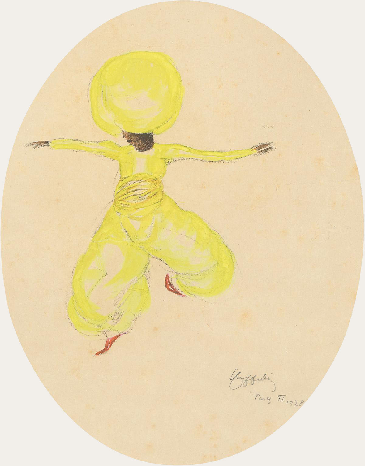
Leonetto Cappiello (1875-1942) ~ Turbaned dancer in midair wearing a bright yellow outfit, 1928. Watercolor and charcoal drawing | src invaluable
Leonetto Cappiello (1875-1942) ~ Asti Cinzano poster, 1910s | src RetroGraphik

The Cappiello Style

Cappiello is credited to revolutionize the old thinking of poster illustration during his time. His concept of poster art was simple, to simply engage audience faster by creating unconventional visual impact. He was the first poster artist to boldly experiment and innovate new graphical styles at the time. His presentation was straight forward with use of enlarged bold subjects with unconventional colors,contrasted by the very dark background, which make his art “pop out”. By doing so he moved away from illustrating intricate details in his artworks, which was famous at the time as Art Nouveau movement was popular.

Between 1901 and 1914, he created several hundred posters in a style that revolutionized the art of poster design. Cappiello redesigned the fin-de-siècle pictures into images more relevant to the faster pace of the 20th century.

His new functionalist style of graphic art, in which a single bold image would be used to grab the viewer’s attention. This graphic design proved highly effective, not only in drawing attention to the product but also in building a brand. It made Cappiello the acknowledged master of the advertising poster in his time for almost 20 years. | src RetroGraphik

Jan Toorop · Salad Oil style

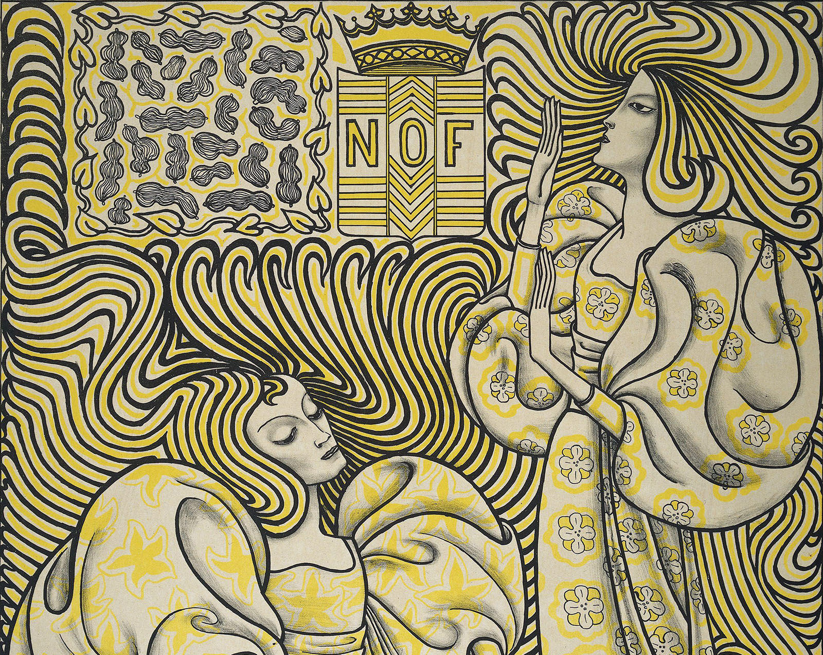
Jan Toorop ~ Poster for Delft Salad Oil, 1894 (RP-P-1912-2395) | src Rijksmuseum

Affiche Delftsche Slaolie (1894)
This poster was commissioned by the Nederlandsche Oliefabriek, an oil manufacturer in Delft. Two women with wavy hair and billowing draperies occupy most of the composition. One of them is dressing a salad.

The inscription on top Delftsche Slaolie makes it clear that the advert concerns salad oil, as do the bottles of salad oil on either side of the text. Below it is the crowned coat of arms of the factory (N O F), with a decorative area with peanuts on the left. The majority of the poster is taken up by the two graceful female figures with long hair and billowing draperies. One sits and is dressing a lettuce salad in a large container; the other has her gaze and hands raised. The women with their emphatic contours draw attention away from the actual advertisement, namely for the salad oil. The wavy, rhythmic interplay of lines with which the women’s hair fills the picture surface made such an impression that it became an icon and lent Dutch Art Nouveau its nickname, slaoliestijl, the ‘salad oil style’. | text adapted from Rijksmuseum [x]

Jan Toorop ~ Image Design for a Poster. Wagenaar’s Cantata ‘The Shipwreck’, 1899. Zincograph in blue-black on yellow wove paper | src AIC
Jan Toorop (1858-1928) ~ Two female figures with clock in hand, 1913 (?). Pencil and chalk on paper. | src Rijksmuseum
Jan Toorop ~ Twee gestileerde vrouwelijke figuren met klok in de hand (1894)

Jan Toorop (1858–1928) was born on the island of Java in the Dutch East Indies, Toorop settled in the Netherlands at the age of eleven. After studying art at the Rijksakademie in Amsterdam, he’d spend his time between The Hague, Brussels, England (where his wife was from), and, after 1890, the Dutch seaside town of Katwijk aan Zee. It was during this time that he developed his distinctive style: highly stylized figures, embedded in complex curvilinear designs, with his dynamic line showing influence from his Javanese roots. While perhaps most famous for turning these techniques to his exquisite poster designs, Toorop also produced a substantial body of work far removed from the anodyne demands of the advertising industry, beautiful but haunting works dealing with darker subjects such as loss of faith and death (that you can find in this other post). | text adapted from Public Domain review

Cassandre poster design

A.M. Cassandre :: Poster for the Paris newspaper L'Intransigeant, designed by Cassandre, 1925. Collection of Philip B. Meggs Printer: Hachard & Cie., Paris | src MoMA
A.M. Cassandre :: Poster for the Paris newspaper L’Intransigeant, designed by Cassandre, 1925. Printer: Hachard & Cie., Paris | src MoMA

Cassandre (1901-1968) or A.M. Cassandre (the pseudonym of Adolphe-Jean-Marie Mouron) was a graphic artist, stage designer, and painter whose poster designs greatly influenced advertising art in the first half of the 20th century.

Cassandre used figurative geometry and modulated planes of colour, derived from Cubism, to revitalize postwar French poster design. From 1923 until 1936, Cassandre designed posters in which he reduced his subject matter to bold shapes and flat, modulated icons. He emphasized two-dimensional pattern, and he integrated lettering with his imagery to make a unified overall composition. Cassandre also utilized airbrushed blends and grading to soften rigid geometry. 

A.M. Cassandre (Adolphe Mouron, 1901-1968)
A.M. Cassandre (Adolphe Mouron, 1901-1968) :: 1932 version of the “Dubonnet” poster. Alliance Graphique, Paris. | src Rennert Gallery

Cassandre gained a reputation with such posters as “Étoile du Nord” (1927) and “Dubo Dubon Dubonnet” (1932). The Dubonnet posters were among the earliest designed specifically to be seen from fast-moving vehicles, and they introduced the idea of the serial poster, a group of posters to be seen in rapid succession to convey a complete idea.

In 1926 Cassandre cofounded the advertising agency Alliance Graphique and soon turned his attention to experimental typography. He designed three typefaces: Bifur (1929), Acier Noir (1935) and Piegnot (1937). In 1939 he abandoned poster art and henceforth devoted himself to designing stage sets and to painting.

quoted from Encyclopædia Britannica

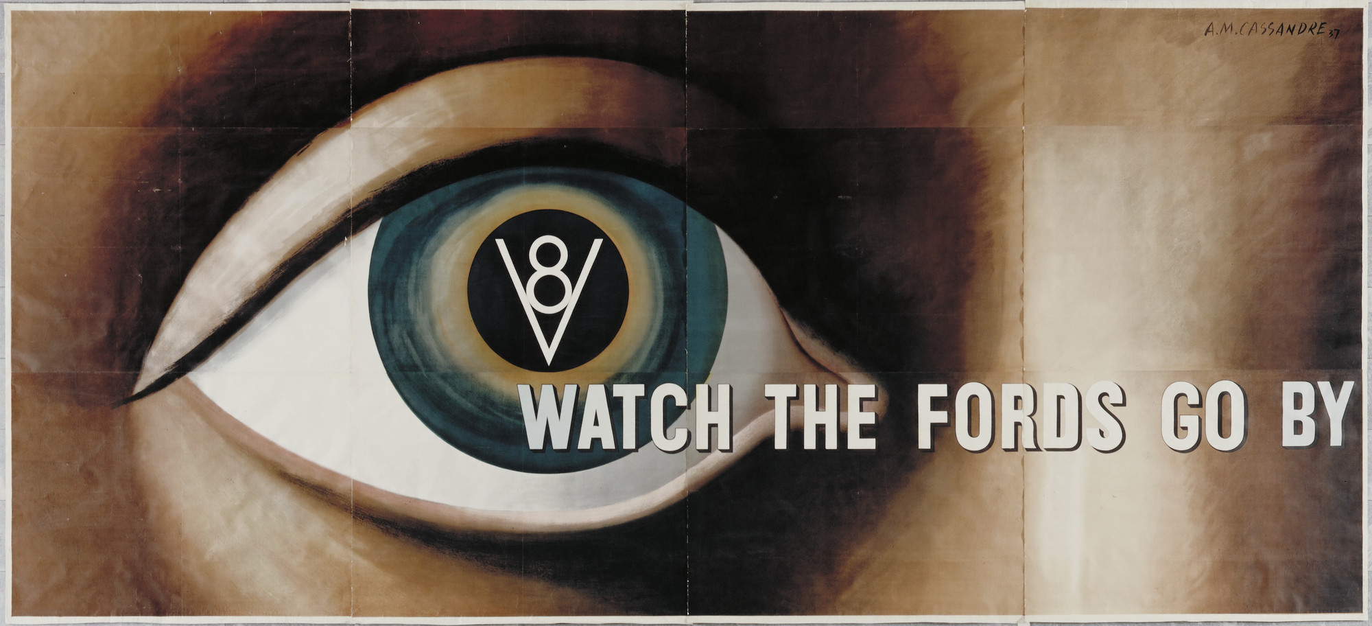
A.M. Cassandre :: Watch the Fords Go By (Poster for Ford Motor Company), 1935 | src MoMA

Ford was the first manufacturer to develop a V8 engine—previously associated with luxury and specialist cars—for a mass market. In employing Cassandre, Ford infused its corporate reputation for industrial innovation with the artistic cachet of European modernism. Cassandre was already established as a preeminent French poster designer and in 1936 he had become the first graphic artist to have a solo exhibition at MoMA. This compelling image of a disembodied, all-seeing eye is rooted in a classical tradition that emphasizes the primacy of vision in Western culture; the eye is also prevalent in Surrealist art of the 1920s. Trailing from the iris, the slogan “Watch the Fords Go By” gives a sense of modern vision, always in motion, while the V8 icon imprinted on the pupil suggests a fusion of mind, body, and technology—a synthesis that revolutionized individual perception in the modern world.

Gallery label from Shaping Modernity: Design 1880-1980, December 23, 2009–July 25, 2010 (MoMA)

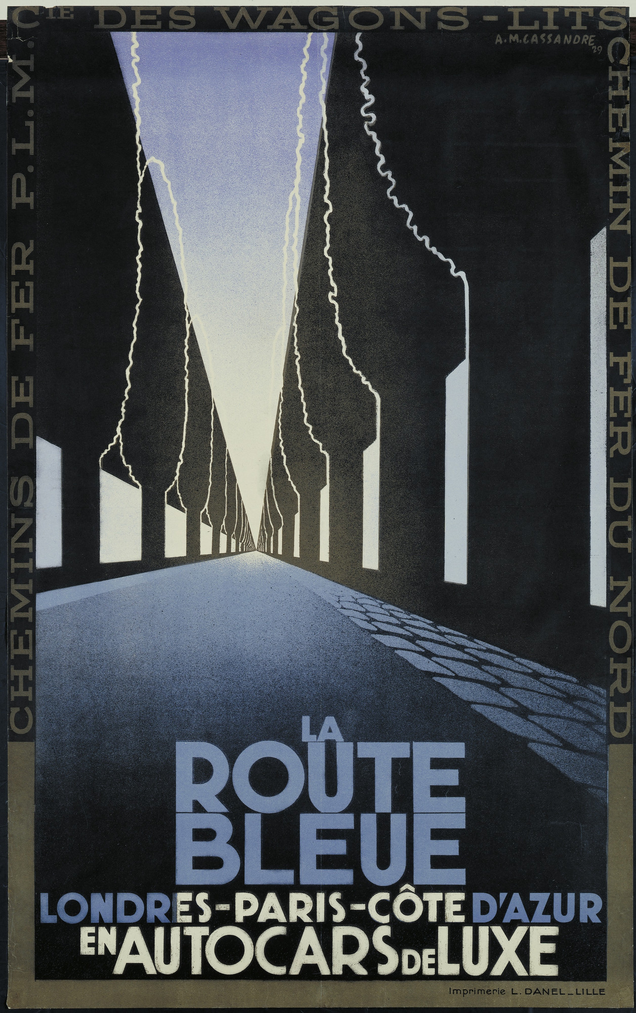
A.M. Cassandre :: La Route Bleu, Londres-Paris-Côte d’Azur en Autocars de Luxe, 1929 | MoMA
A.M. Cassandre :: Fêtes de Paris, 1935. | MoMA
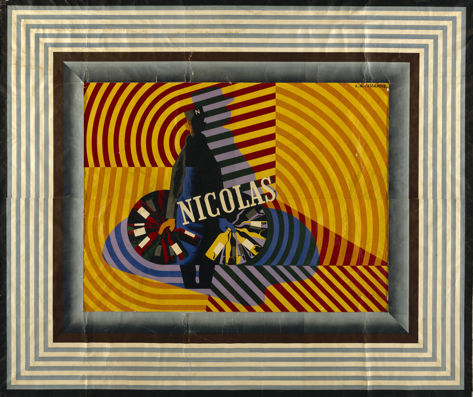
A.M. Cassandre :: Nicolas, 1935 | src MoMA

Nijinsky and Karsavina

Jean Cocteau (1889-1963) :: Théatre de Monte-Carlo; Ballet Russe; [Nijinsky]. Lithograph in colours, 1911
Jean Cocteau (1889-1963) :: Théatre de Monte-Carlo; Ballet Russe; [Nijinsky]. Lithograph in colours, 1911, printed by Eugène Verneau & Henri Chachoin, Paris. | src Christie’s
Jean Cocteau (1889-1963) :: Théatre de Monte-Carlo; Ballet Russe; [Karsavina], 1911. Lithographic poster in colors on wove paper, printed by Eugène Verneau & Henri Chachoin, Paris. Severin Wunderman Family Museum | src Bonhams
Jean Cocteau (1889-1963) :: Théatre de Monte-Carlo; Ballet Russe; [Karsavina], 1911
Jean Cocteau (1889-1963) :: Théatre de Monte-Carlo; Ballet Russe; [Karsavina], 1911 [Detail]
Jean Cocteau (1889-1963)
THÉATRE DE MONTE-CARLO, BALLET RUSSE [Karsavina]
Lithograph in colours, 1911, printed by Eugène Verneau & Henri Chachoin, Paris | src Christie's
Jean Cocteau (1889-1963) :: Théatre de Monte-Carlo; Ballet Russe; [Karsavina]. Lithograph in colours, 1911, printed by Eugène Verneau & Henri Chachoin, Paris. | src Christie’s
d'après Jean Cocteau (1889-1963)
EXPOSITION BALLETS RUSSES DE DIAGHILEW
lithographic poster in colours, 1939, cond. A, backed on linen
Exposition: Ballets Russes de Diaghilew; d’après Jean Cocteau (1889-1963); lithographic poster in colours, 1939. | src Bonhams

Cramérbaletten costume design

costume design, dance costume
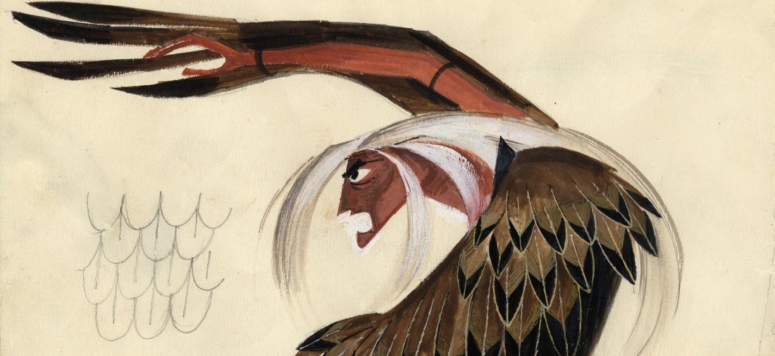
Kostymskiss till Husmodern. Häxan i Vindarnas Kulle, Cramérbaletten. Av Torkel Edenborg.
Costume sketch for Husmodern. The Witch in the Hill of the Winds, Cramér ballet. By Torkel Edenborg. | src Dansmuseet
Kostymskiss till Husmodern. Häxan i Vindarnas Kulle, Cramérbaletten. Av Torkel Edenborg.
Costume sketch for Husmodern. The Witch in the Hill of the Winds, Cramér ballet. By Torkel Edenborg. | src Dansmuseet
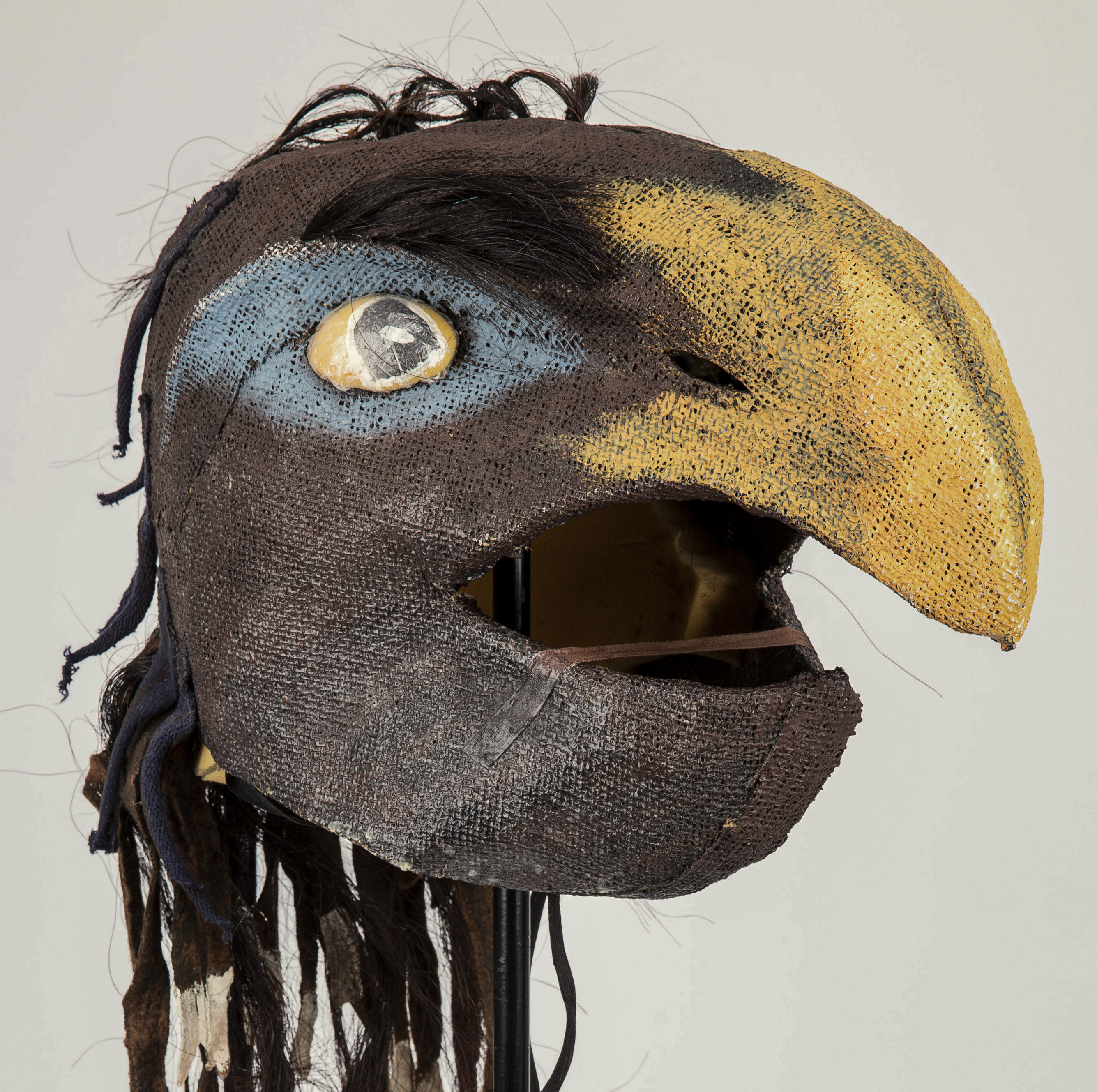
Korp. Mask till en av fyra korpar från uppsättningen "Domardansen". Av Torkel Edenborg.
Raven. Mask for one of the four ravens from the "Judge's Dance" set. | src Dansmuseet
Korp. Mask till en av fyra korpar från uppsättningen “Domardansen”. Av Torkel Edenborg.
Raven. Mask for one of four ravens from the “Judge’s Dance” set. | src Dansmuseet
Mask till "Drängen" från uppsättningen "Vindarnas kulle", Cramérbaletten. Av Torkel Edenborg. 
Farmer. Mask for "Drängen / Farmer" from the set "The Hill of the Winds", Cramér ballet. | src Dansmuseet
Mask till “Drängen” från uppsättningen “Vindarnas kulle”, Cramérbaletten. Av Torkel Edenborg.
Farmer. Mask for “Drängen / Farmer” from the set “The Hill of the Winds”, Cramér ballet. | src Dansmuseet
'Cramer Baletten, Svenska Riksteatern', a poster designed by Bjorn Wiimblad, 1980 (?). | src Sworders
‘Cramer Baletten, Svenska Riksteatern’, a poster designed by Bjorn Wiimblad, 1980 (?). | src Sworders
Korp. Mask till en av fyra korpar från uppsättningen "Domardansen". Av Torkel Edenborg.
Raven. Mask for one of the four ravens from the "Judge's Dance" set. | src Dansmuseet
Korp. Mask till en av fyra korpar från uppsättningen “Domardansen”. Av Torkel Edenborg.
Raven. Mask for one of the four ravens from the “Judge’s Dance” set. | src Dansmuseet

The Chalice of Sorrow (1916)

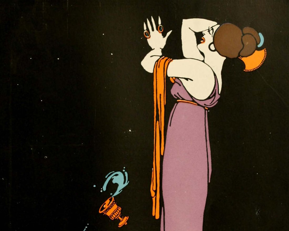
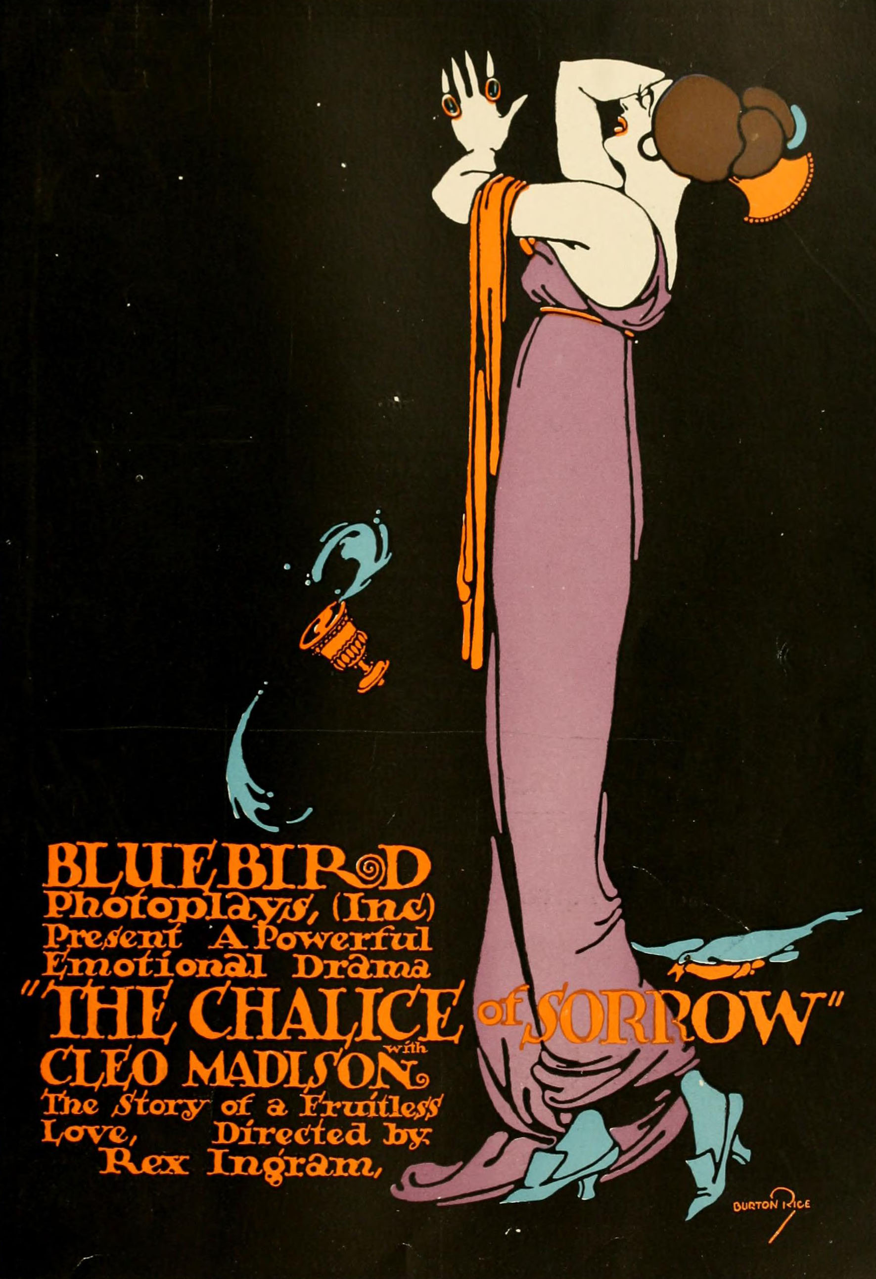
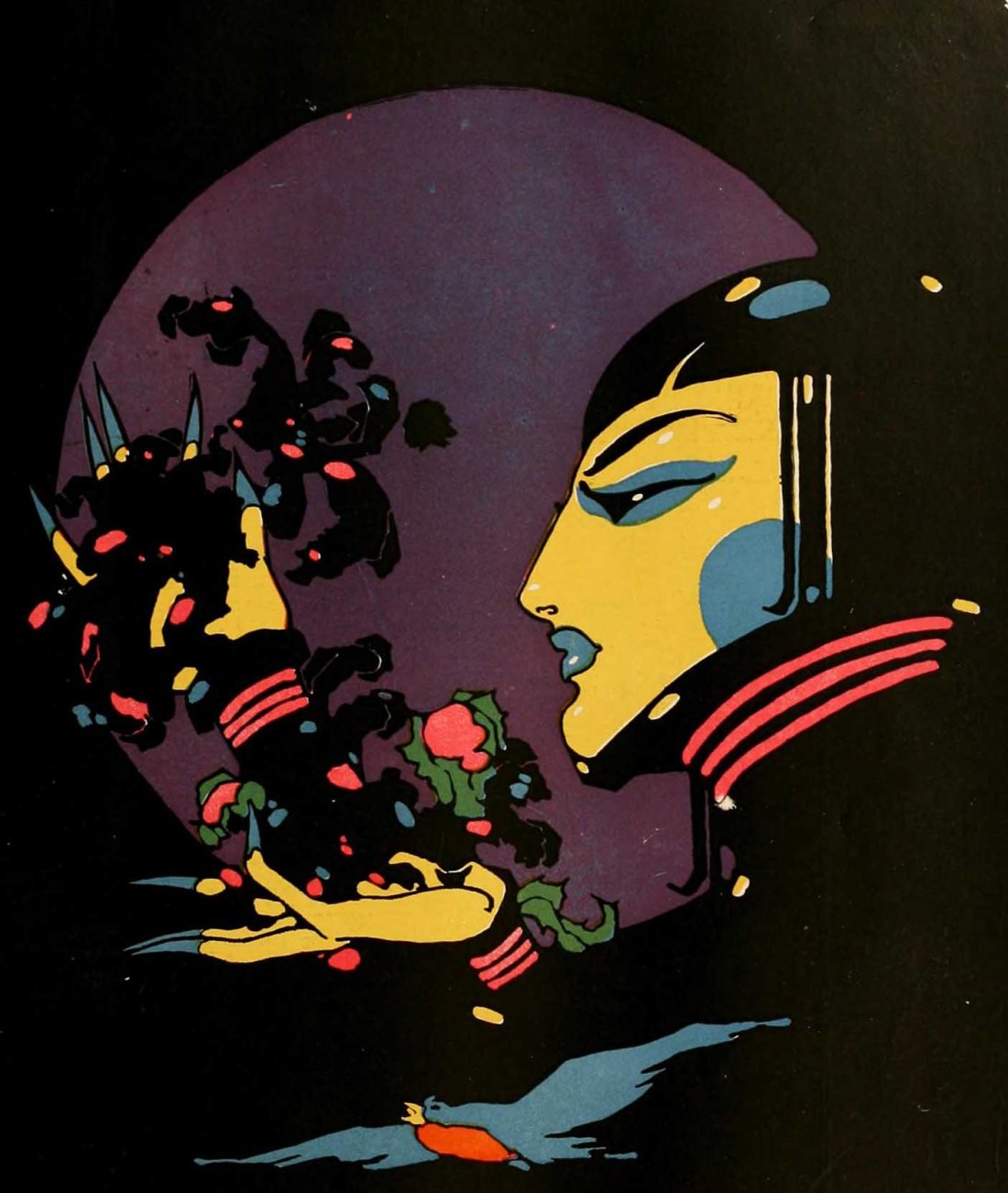
Advertisement for The Chalice of Sorrow (1916). Signed: Burton Rice
A powerful emotional drama "The Chalice of Sorrow" [aka, The Fatal Promise] with Cleo Madison. The Story of a Fruitless Love, directed by Rex Ingram. Moving Picture World, November 1916
A powerful emotional drama “The Chalice of Sorrow” [aka, The Fatal Promise] with Cleo Madison. The Story of a Fruitless Love, directed by Rex Ingram. Moving Picture World, November 1916

Bluebird Photo-Plays began advertising in Moving Picture World, January 8, 1916. Burton Rice created the advertisements for Bluebird Photo-Plays that appeared in Moving Picture World beginning April 15, 1916. On December 23th, 1916 MPW published a short article on Burton Rice and his plans of moving to Europe. He left the US, moved to Paris and mailed his artwork to Bluebird Photo-Plays in New York City. In 1917 Rice produced fewer works for Bluebird Photo-Plays. Ethel Rundquist was hired to fill-in for Rice and eventually replaced him.

In the second half of the 1920s, Rice began using the pen name, Dynevor Rhys. From 1930 to 1935 Rice, as Rhys, was credited with almost three dozen covers for The Delineator. He contributed drawings to Harper’s Bazaar.

A powerful emotional drama “The Chalice of Sorrow” [aka, The Fatal Promise] with Cleo Madison. The Story of a Fruitless Love, directed by Rex Ingram. Motion Picture News, October 1916

Black Orchids (1916)

Illustration from the advertisement for Black Orchids. Signed: Rice / Paris
Cleo Madison in "Black Orchids". The Love Affairs of a Heartless Woman. Produced by Rex Ingram. Moving Picture World, December 1916
Cleo Madison in “Black Orchids“. The Love Affairs of a Heartless Woman. Produced by Rex Ingram. Moving Picture World, December 1916

In the second half of the 1920s, Rice began using the pen name, Dynevor Rhys. From 1930 to 1935 Rice, as Rhys, was credited with almost three dozen covers for The Delineator. He contributed drawings to Harper’s Bazaar.

Bluebird Photo-Plays began advertising in Moving Picture World, January 8, 1916. Burton Rice created the advertisements for Bluebird Photo-Plays that appeared in Moving Picture World beginning April 15, 1916. On December 23th, 1916 MPW published a short article on Burton Rice and his plans of moving to Europe. He left the US, moved to Paris and mailed his artwork to Bluebird Photo-Plays in New York City. In 1917 Rice produced fewer works for Bluebird Photo-Plays. Ethel Rundquist was hired to fill-in for Rice and eventually replaced him.

Shells and design, late 1970s

Karel Vaca :: Dívka s Mušlí (Girl with a shell), 1980. Vintage movie poster, offset print. Movie directed by Jiří Svoboda. | src Zezula
Karel Vaca (1919-1989) :: Dívka s Mušlí (Girl with a shell), 1980. Vintage movie poster, offset print. Movie directed by Jiří Svoboda. | src Zezula
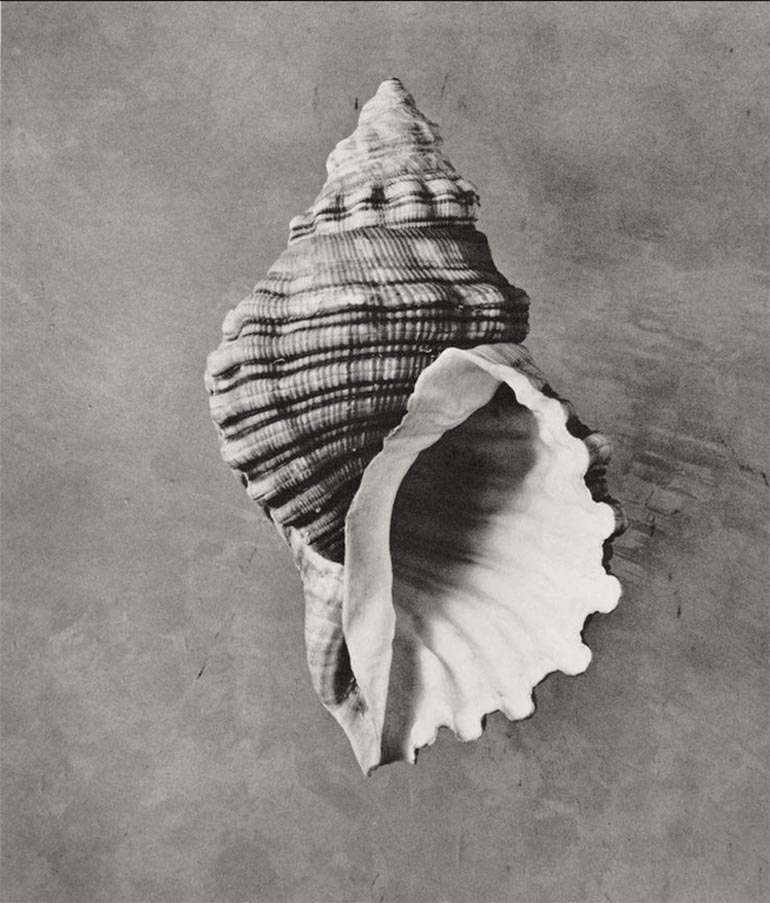
Cymatium spengleri Perry. From "The shell: five hundred million years of inspired design" by Hugh Stix and Marguerite Stix, 1979. | src equator on IG
Cymatium spengleri Perry. From “The shell: five hundred million years of inspired design” by Hugh Stix and Marguerite Stix, 1979. | src equator on IG

Valeska Gert by Mammen / Kainer

Valeska Gert, gemalt von Jeanne Mammen; 1928-1929 © Berlinische Galerie. | src Welt.de
Ludwig Kainer :: Valeska Gert. Groteske Tänze. Plakat. 1917. Das Plakat, Mai-Juli 1918