


images that haunt us


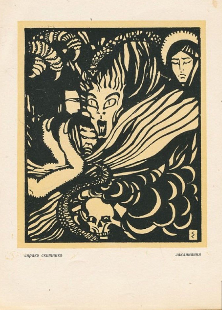
If you wish to learn more or read more about Sirak Skitnik and Bulgarian Modernism or Native Art, you may want to dig further here:
Modernism and the National Idea in Bulgaria @ sledva.nbu.bg (in English)
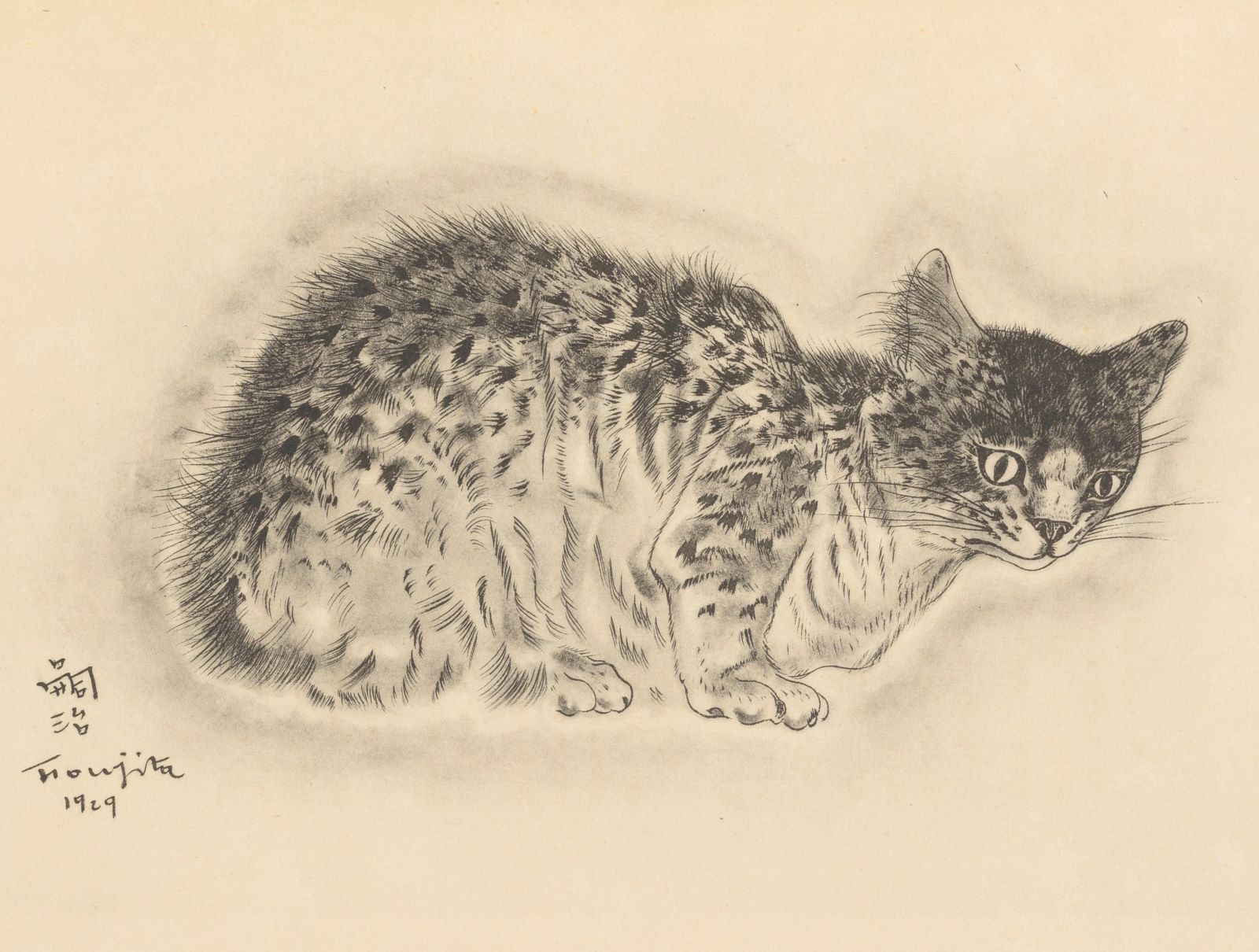
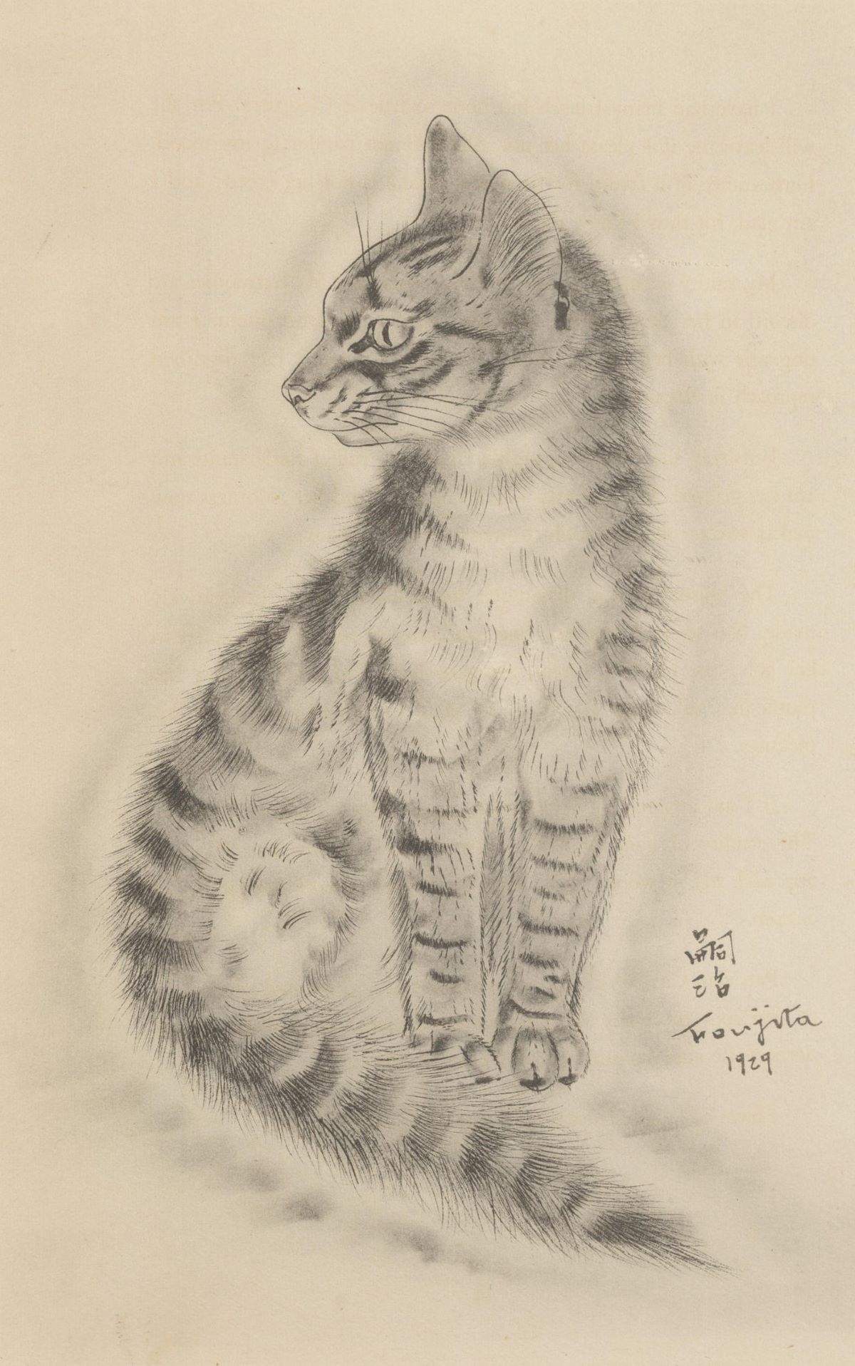
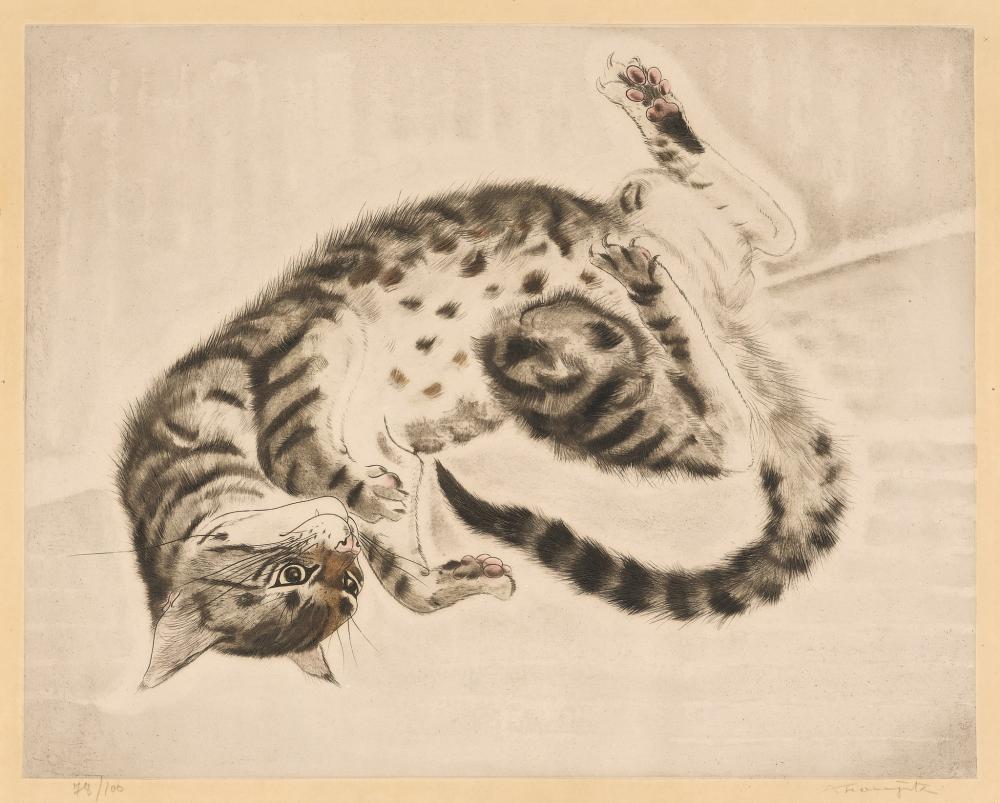
The whole batch of illustrations from the book are available to be viewed (but in very poor resolution) at the NYPL


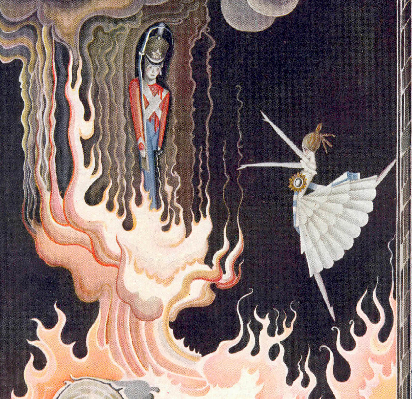
The draught of air caught the dancer, and she flew like a sylph just into the stove to the tin soldier. [The Tin Soldier and the Dancer ~ The Brave Tin Soldier ~ The Hardy Tin Soldier (1838)]


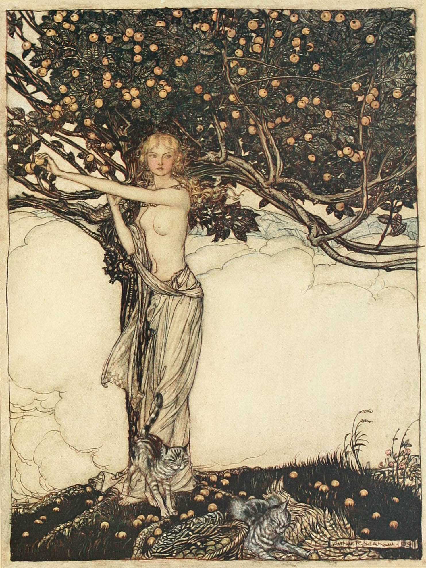


All illustrations are from : The Rhinegold & The Valkyrie by Richard Wagner (1813-1883). Illustrations by Arthur Rackham (1867-1939). Published in 1910. New York Public Library at internet archive
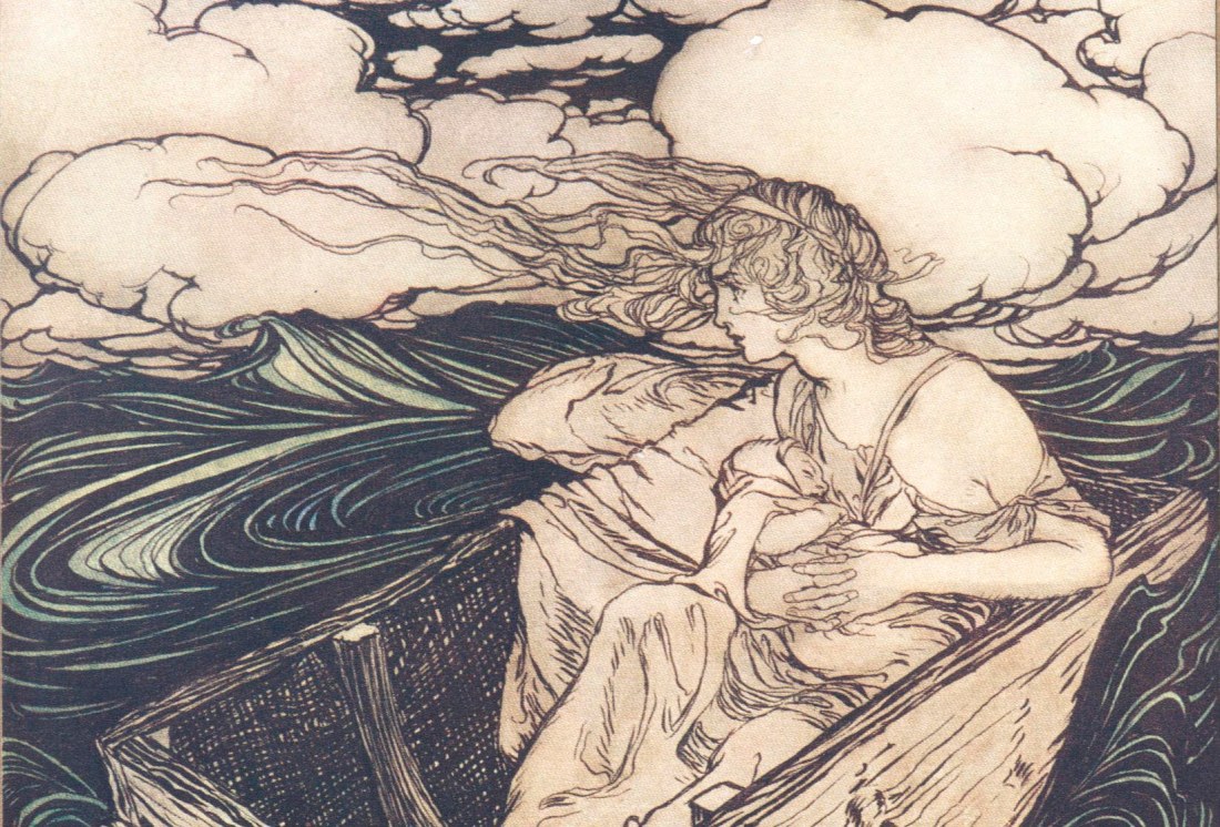


You could spend hours marveling at Arthur Rackham’s work. The legendary illustrator, born on September 19, 1867, was incredibly prolific, and his interpretations of Peter Pan, The Wind in the Willows, Grimm’s Fairy Tales, A Midsummer Night’s Dream, and Rip Van Winkle (to name but a few) have helped create our collective idea of those stories.
Rackham is perhaps the most famous of the group of artists who defined the Golden Age of Illustration, the early twentieth-century period in which technical innovations allowed for better printing and people still had the money to spend on fancy editions. Although Rackham had to spend the early years of his career doing what he called “much distasteful hack work,” he was famous—and even collected—in his own time. He married the artist Edith Starkie in 1900, and she apparently helped him develop his signature watercolor technique. From the publication of his Rip Van Winkle in 1905, his talents were always in high demand.
He had the advantage of a canny publisher, too, in William Heinemann. Before the release of each book, Rackham would exhibit the original illustrations at London’s Leicester Galleries, and sell many of the paintings. Meanwhile, Heinnemann had the notion to corner multiple markets by releasing both clothbound trade books and small numbers of signed, expensively bound, gilt-edged collectors’ editions. When the British economy flagged, Rackham turned his attention to Americans, producing illustrations for Washington Irving’s The Legend of Sleepy Hollow and later Poe’s Tales of Mystery and Imagination.
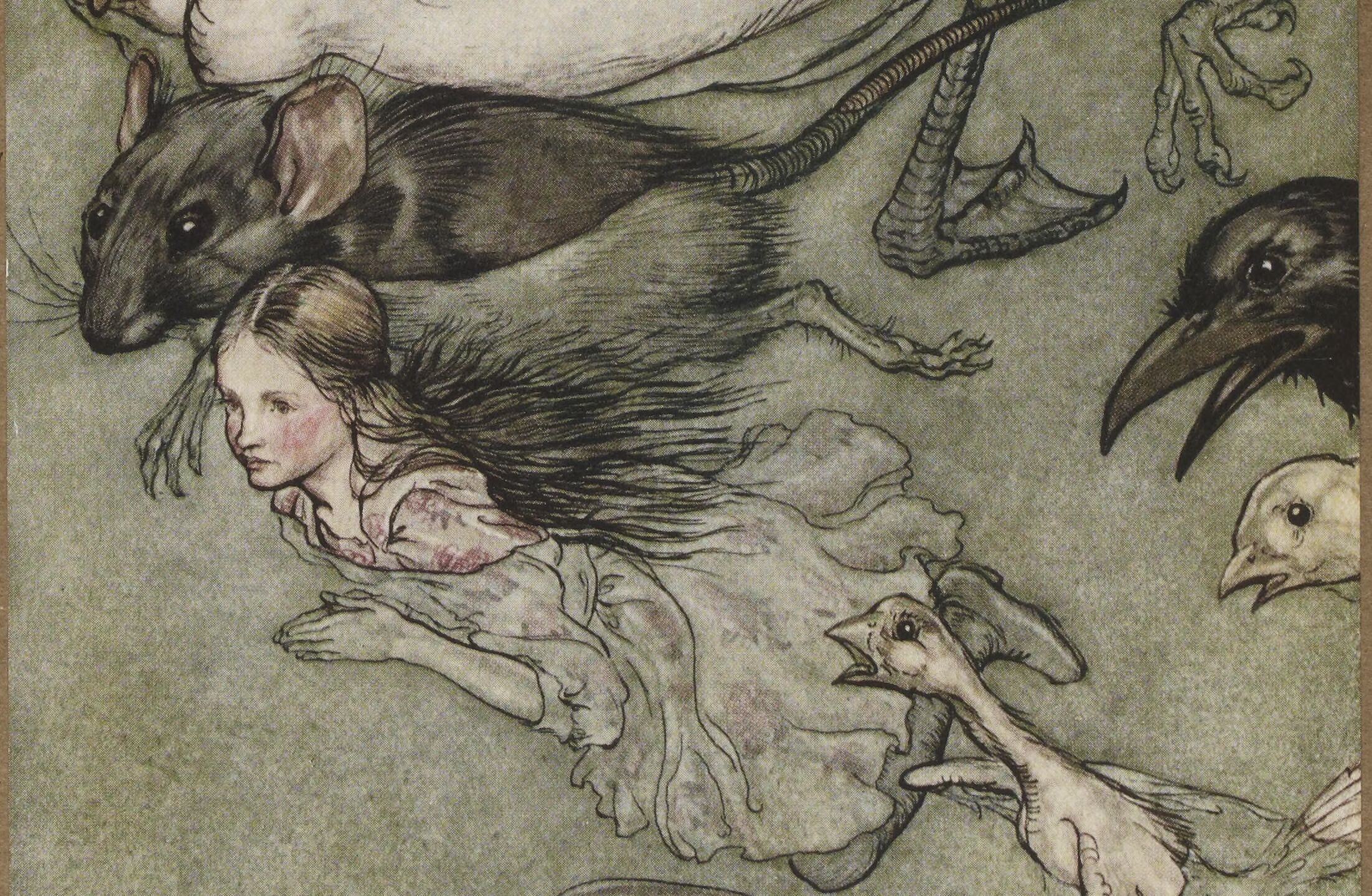
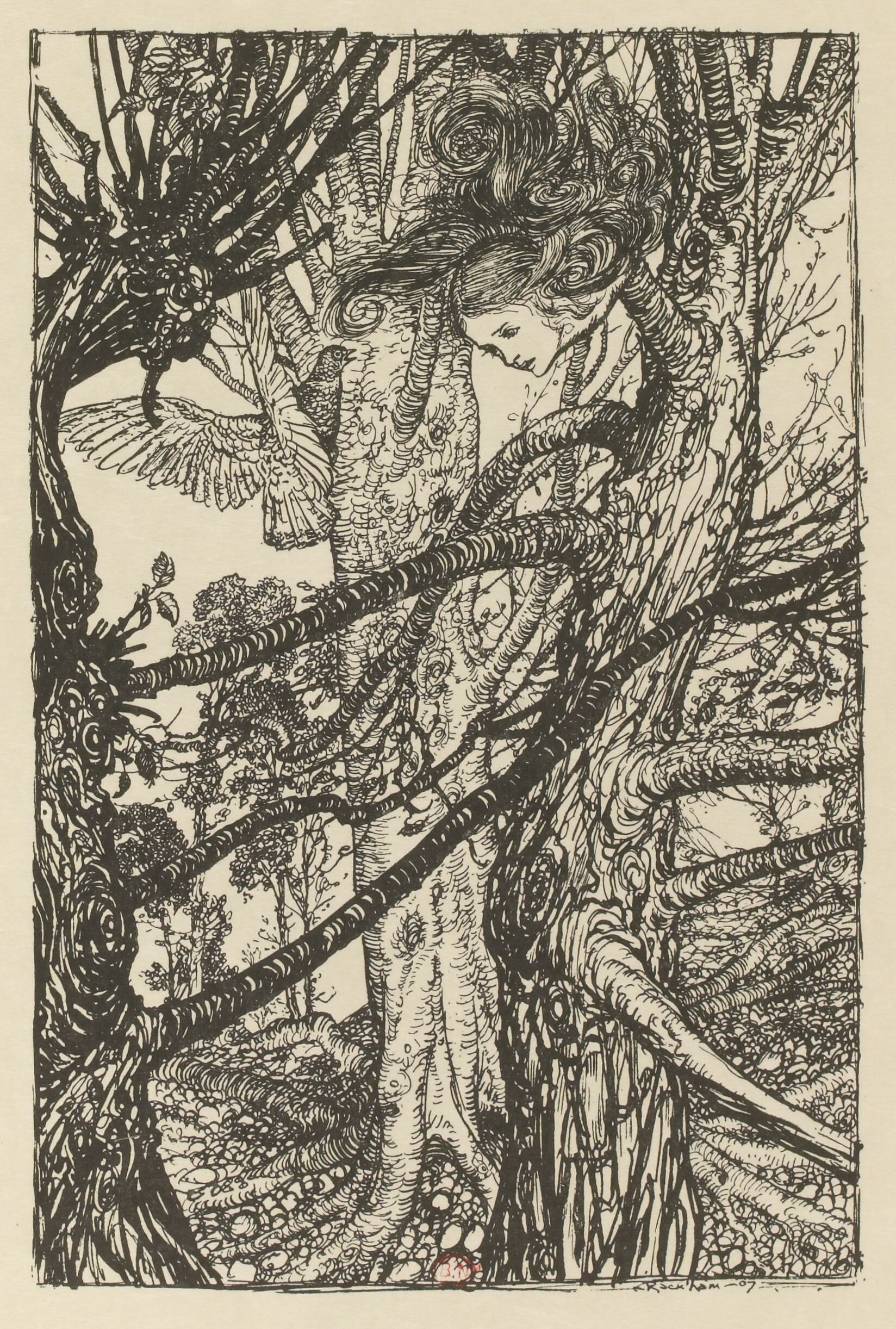
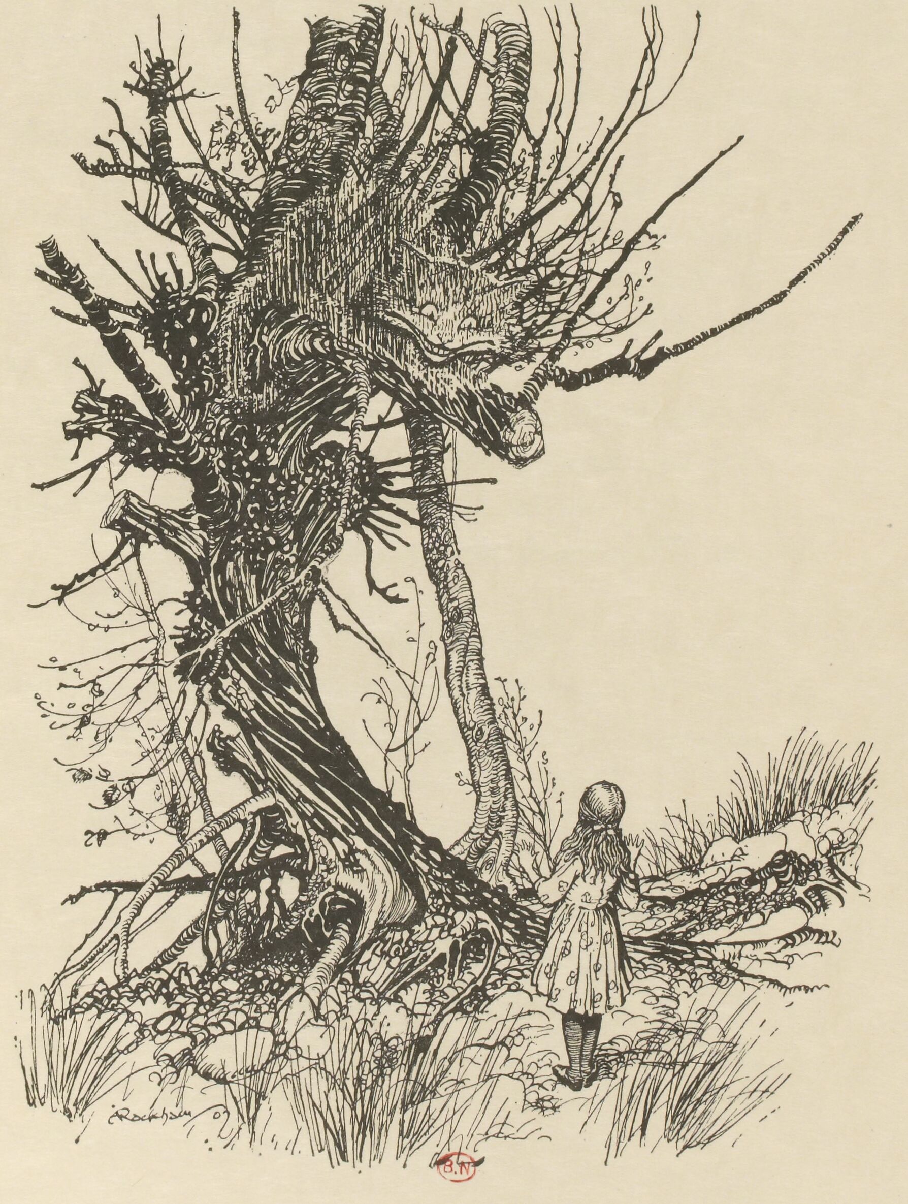
Pragmatic he may have been, but Rackham’s detailed work is pure fantasy, alternately beautiful, romantic, haunting, and sinister. Nothing he did was ever truly ugly, although he could certainly communicate the grotesque. And his illustrations are never cute, although his animals—as in The Wind in the Willows—have a naturalist’s vividness, and he could do whimsy (think Alice in Wonderland, or his many goblins) with the best of them. Several generations of children grew up with this nuanced beauty; it’s probably wielded even more of an aesthetic influence than we attribute to it.
Rackham once said, “Like the sundial, my paint box counts no hours but sunny ones.” This is peculiar when one considers the moodiness of much of his palate, and the unflinching darkness of many of his illustrations. I think, rather, of a quote from his edition of Brothers Grimm: “Evil is also not anything small or close to home, and not the worst; otherwise one could grow accustomed to it.” He made that evil beautiful, too, and it was this as much as anything that enchanted. By Sadie Stein for The Paris Review Blog
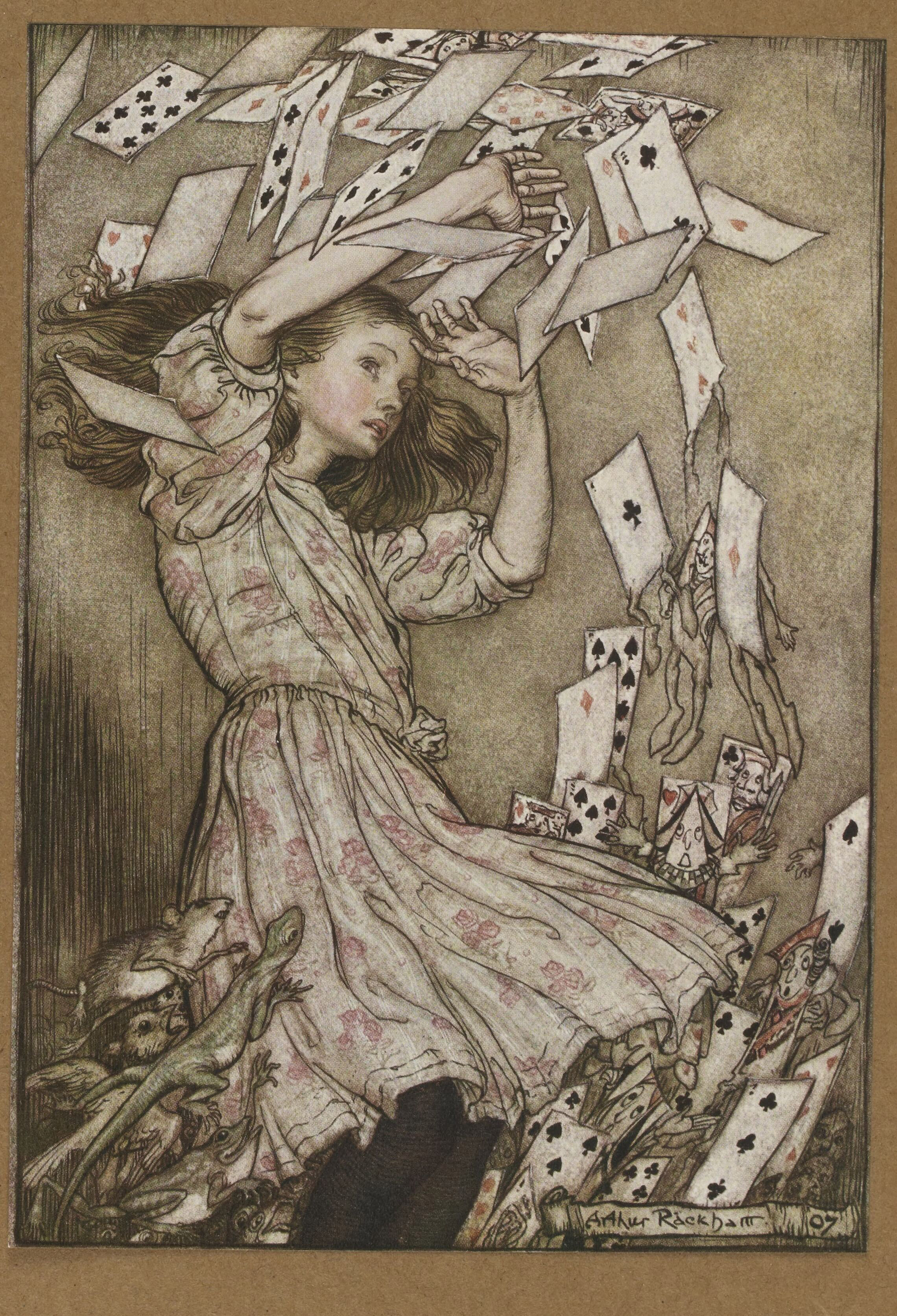
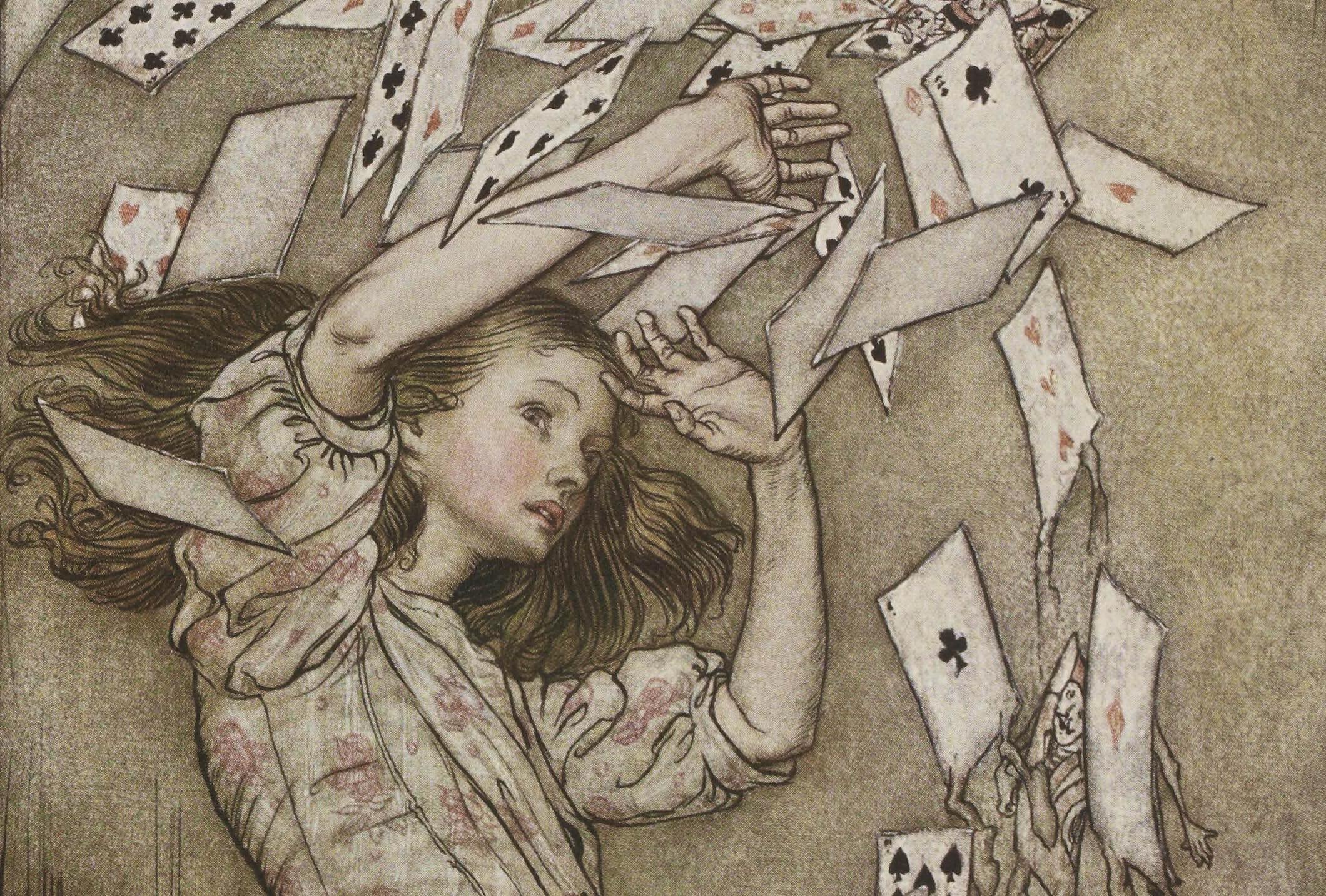
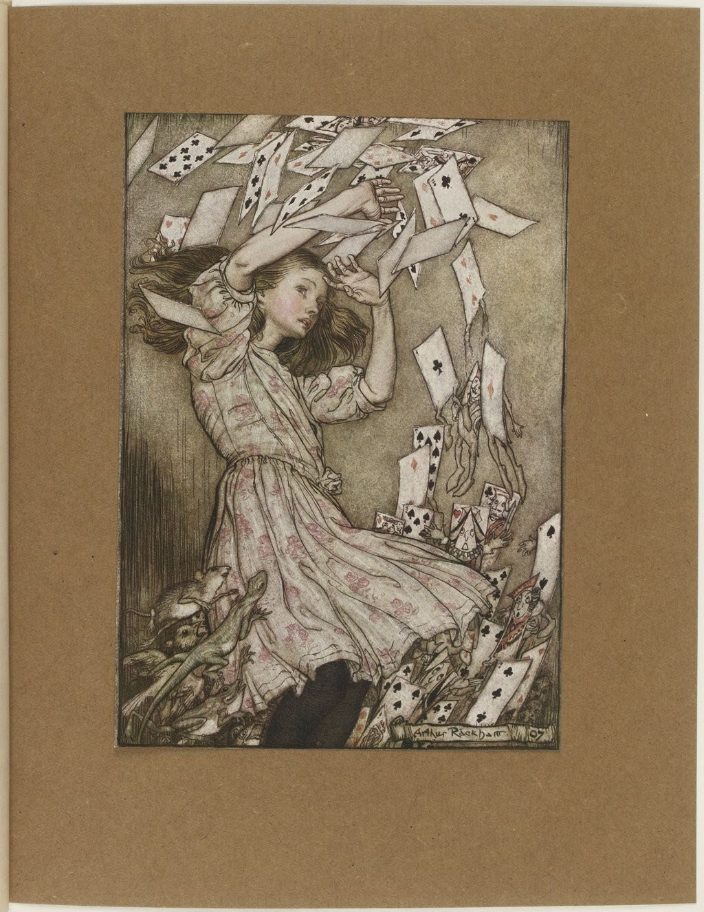
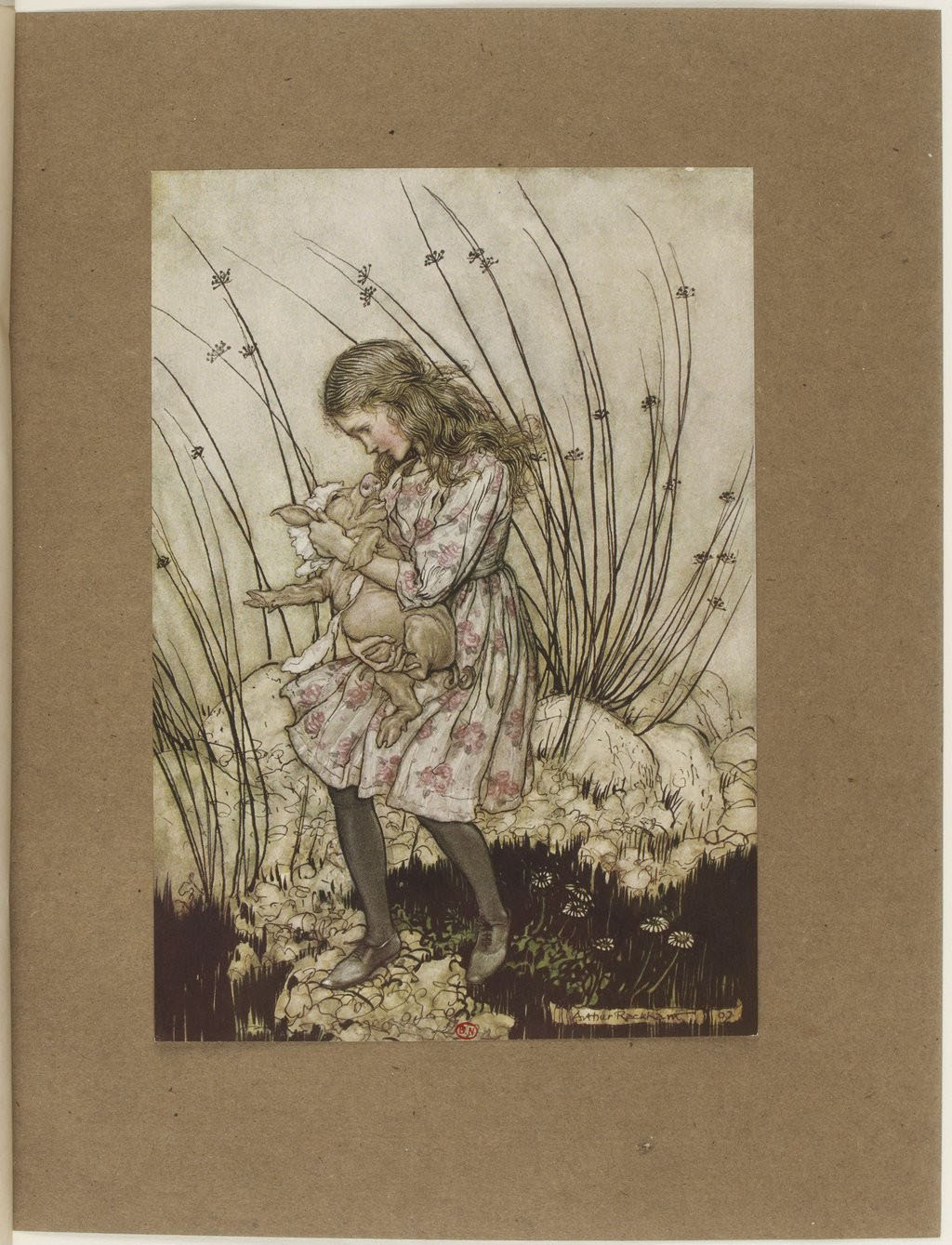


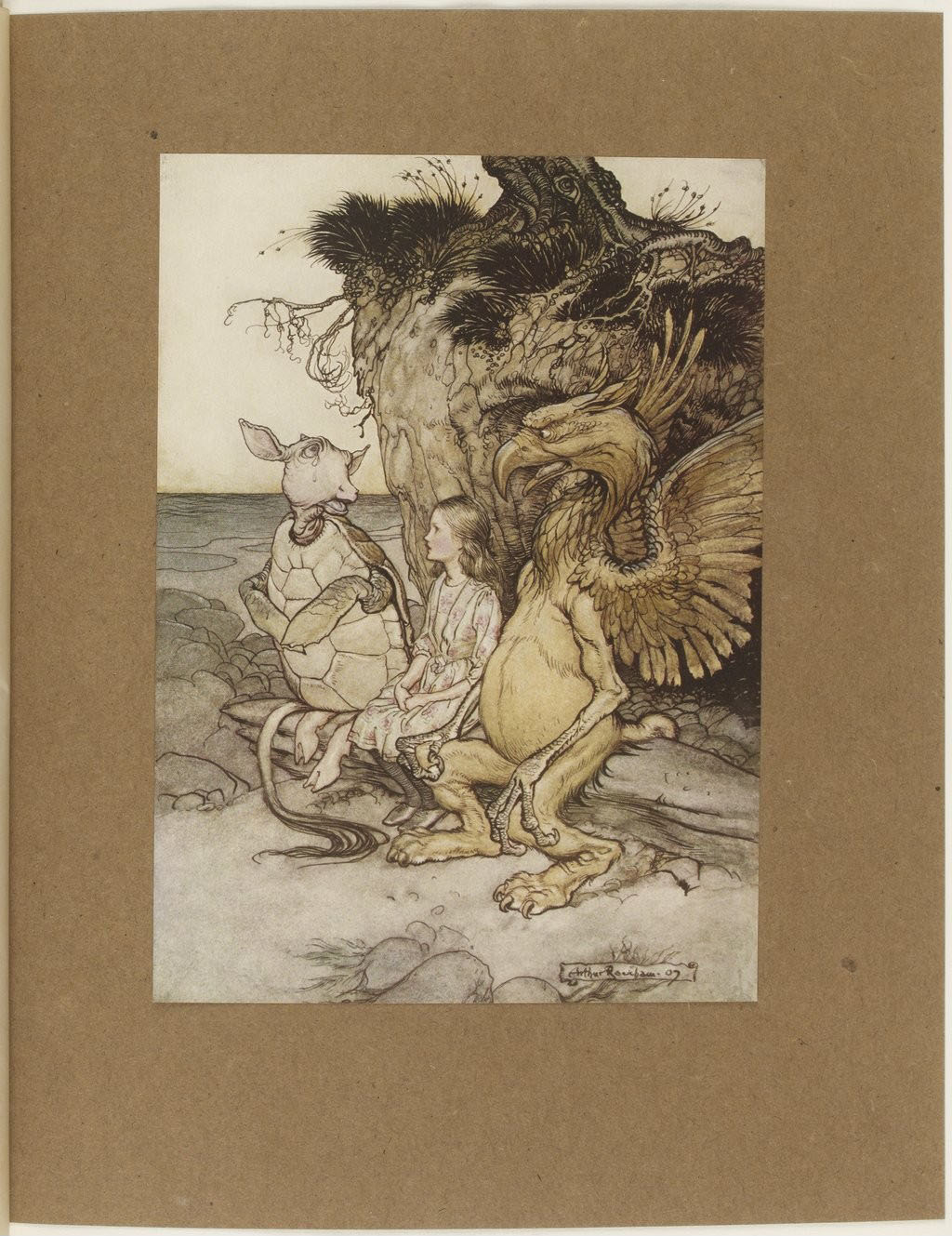


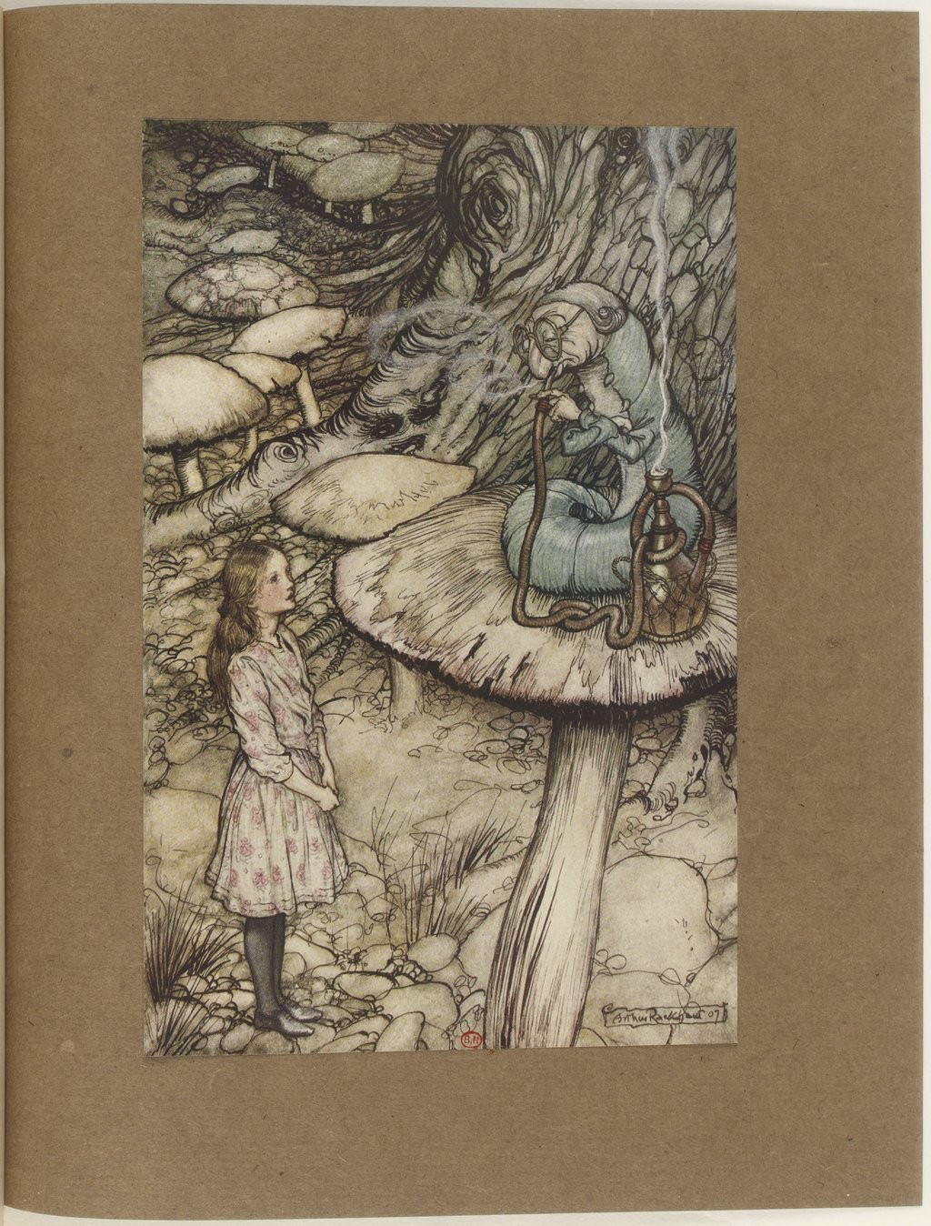
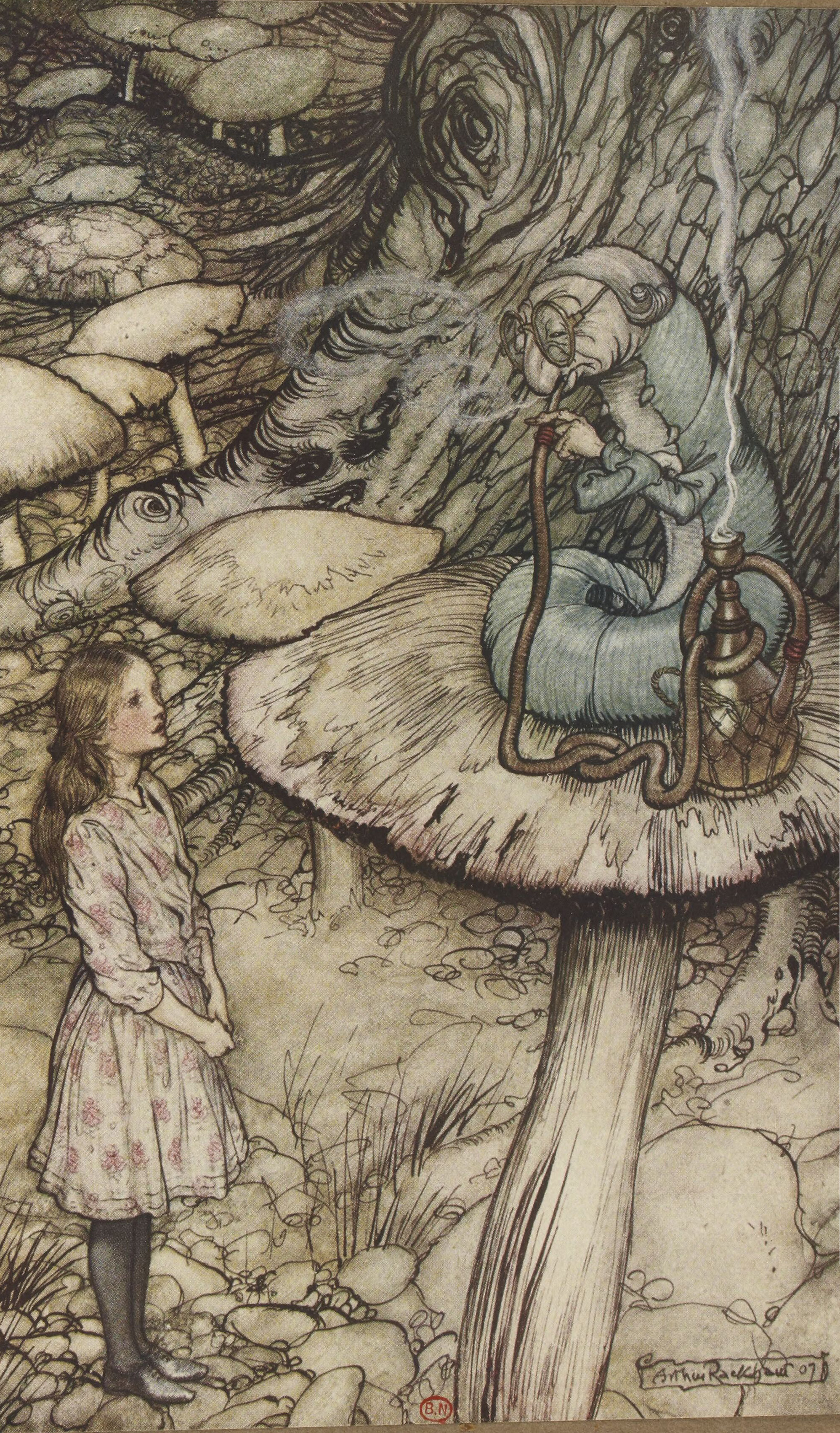


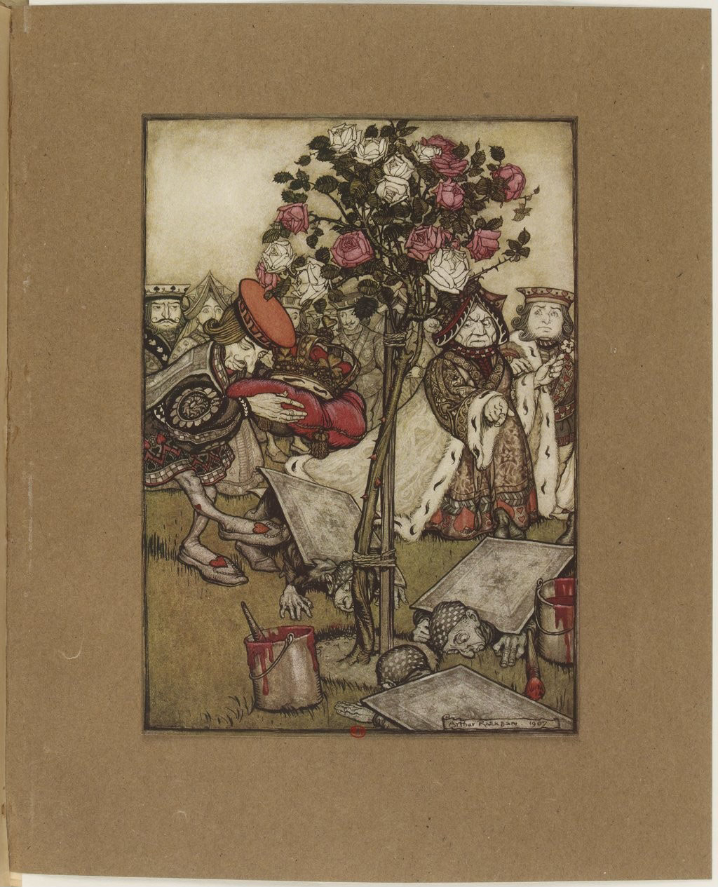
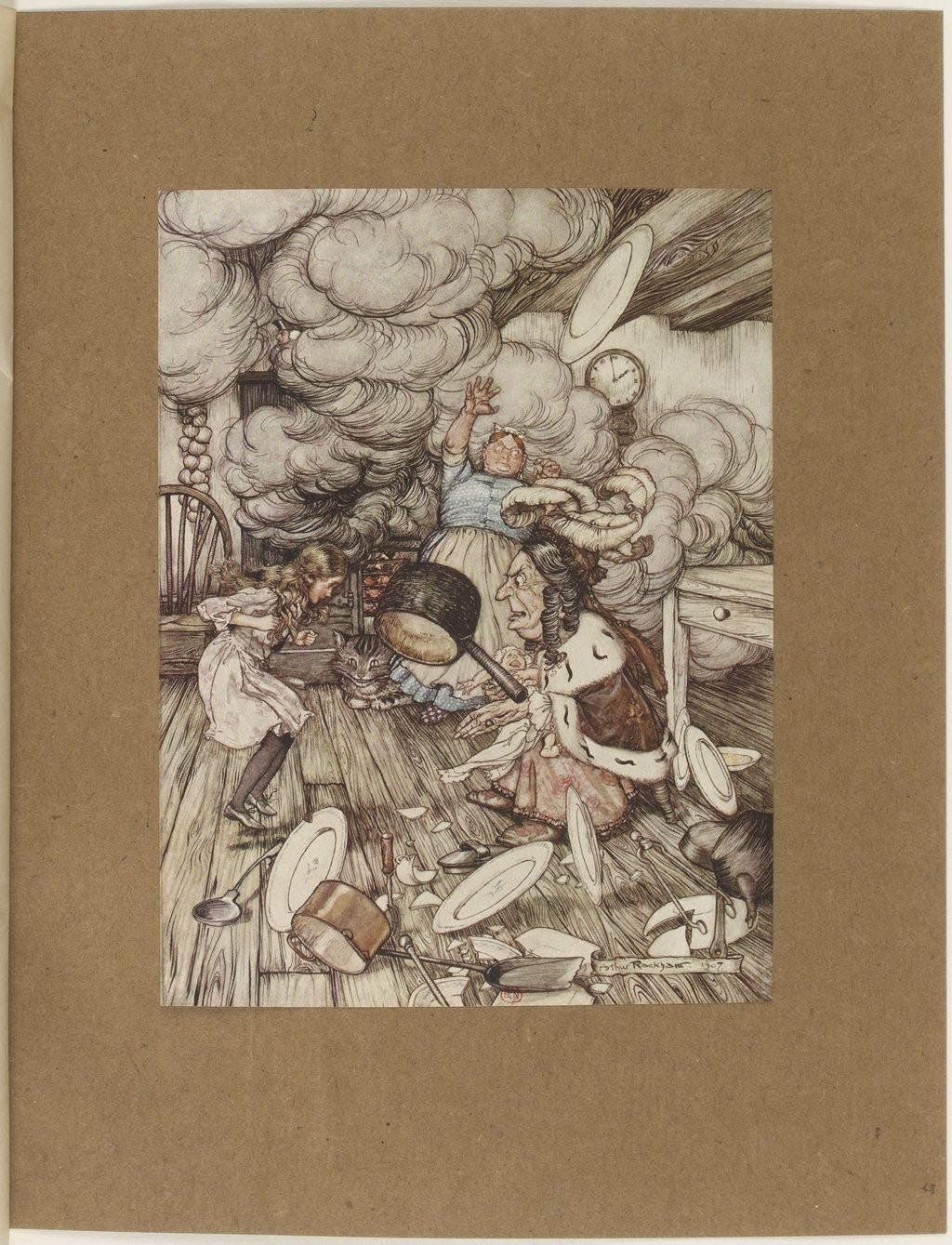

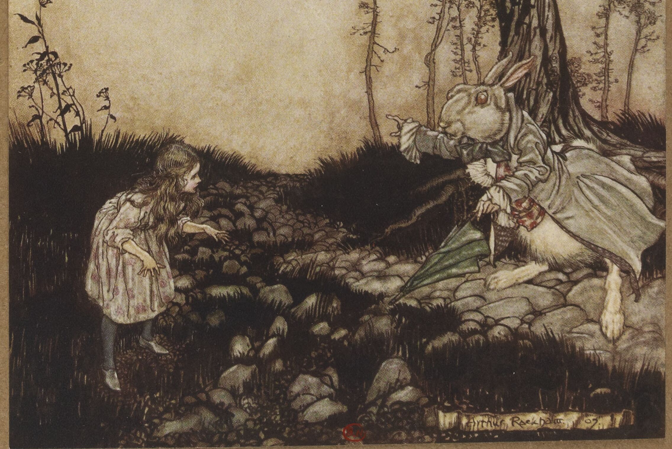
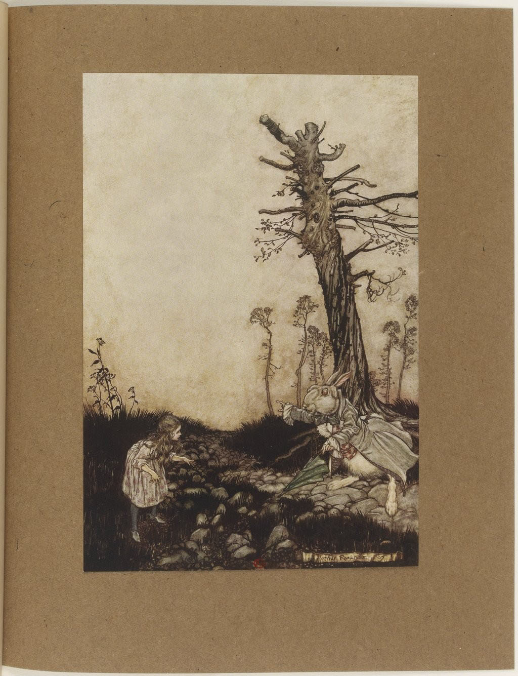

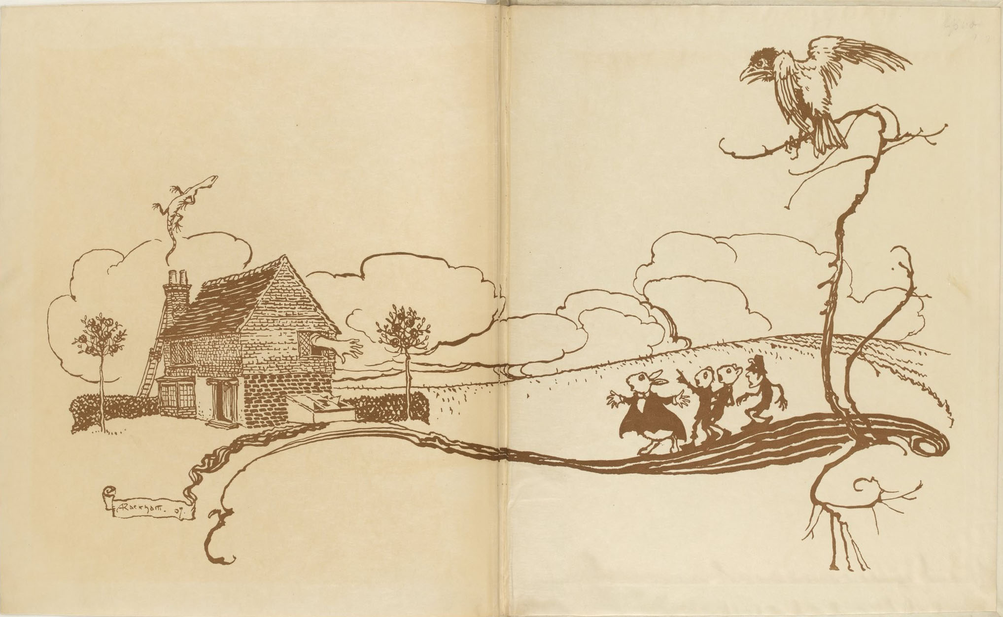
Aventures d’Alice au pays des merveilles par Lewis Carroll ; illustrées par Arthur Rackham
[Alice’s adventures in Wonderland (français)] ; Librairie Hachette et Cie. ; Paris ; publié en 1908
1 vol. (167 p.-[12] f. de pl. en coul.) : ill. en coul., couv. ill.
From : Bibliothèque nationale de France, département des livres rares

About Arthur Rackam
Arthur Rackham is widely regarded as one of the leading illustrators from the ‘Golden Age’ of British book illustration which roughly encompassed the years from 1890 until the end of the First World War. During that period, there was a strong market for high quality illustrated books which typically were given as Christmas gifts. Many of Rackham’s books were produced in a de luxe limited edition, often vellum bound and usually signed, as well as a smaller, less ornately bound quarto ‘trade’ edition. This was sometimes followed by a more modestly presented octavo edition in subsequent years for particularly popular books. The onset of the war in 1914 curtailed the market for such quality books, and the public’s taste for fantasy and fairies also declined in the 1920s.
Rackham’s illustrations were chiefly based on robust pen and India ink drawings. Rackham gradually perfected his own uniquely expressive line from his background in journalistic illustration, paired with subtle use of watercolour, a technique which he was able to exploit due to technological developments in photographic reproduction. With this development, Rackham’s illustrations no longer needed an engraver (lacking Rackham’s talent) to cut clean lines on a wood or metal plate for printing because the artist merely had his works photographed and mechanically reproduced
Rackham would first lightly block in shapes and details of the drawing with a soft pencil, for the more elaborate colour plates often utilising one of a small selection of compositional devices.Over this, he would then carefully work in lines of pen and India ink, removing the pencil traces after the drawing had begun to take form. For colour pictures, Rackham preferred the 3-colour process or trichromatic printing, which reproduced the delicate half-tones of photography through letterpress printing. He would begin painting by building up multiple thin washes of watercolour creating translucent tints. One of the disadvantages of the 3-colour (later 4-colour) printing process in the early years was that definition could be lost in the final print. Rackham would sometimes compensate for this by over-inking his drawings once more after painting. He would also go on to expand the use of silhouette cuts in illustration work, particularly in the period after the First World War, as exemplified by his Sleeping Beauty and Cinderella.
Typically, Rackham contributed both colour and monotone illustrations towards the works incorporating his images – and in the case of Hawthorne’s Wonder Book, he also provided a number of part-coloured block images similar in style to Meiji era Japanese woodblocks.
Rackham’s work is often described as a fusion of a northern European ‘Nordic’ style strongly influenced by the Japanese woodblock tradition of the early 19th century. (quoted from wikipedia)

You could spend hours marveling at Arthur Rackham’s work. The legendary illustrator, born on September 19, 1867, was incredibly prolific, and his interpretations of Peter Pan, The Wind in the Willows, Grimm’s Fairy Tales, A Midsummer Night’s Dream, and Rip Van Winkle (to name but a few) have helped create our collective idea of those stories.
Rackham is perhaps the most famous of the group of artists who defined the Golden Age of Illustration, the early twentieth-century period in which technical innovations allowed for better printing and people still had the money to spend on fancy editions. Although Rackham had to spend the early years of his career doing what he called “much distasteful hack work,” he was famous—and even collected—in his own time. He married the artist Edith Starkie in 1900, and she apparently helped him develop his signature watercolor technique. From the publication of his Rip Van Winkle in 1905, his talents were always in high demand.
He had the advantage of a canny publisher, too, in William Heinemann. Before the release of each book, Rackham would exhibit the original illustrations at London’s Leicester Galleries, and sell many of the paintings. Meanwhile, Heinnemann had the notion to corner multiple markets by releasing both clothbound trade books and small numbers of signed, expensively bound, gilt-edged collectors’ editions. When the British economy flagged, Rackham turned his attention to Americans, producing illustrations for Washington Irving’s The Legend of Sleepy Hollow and later Poe’s Tales of Mystery and Imagination.
Pragmatic he may have been, but Rackham’s detailed work is pure fantasy, alternately beautiful, romantic, haunting, and sinister. Nothing he did was ever truly ugly, although he could certainly communicate the grotesque. And his illustrations are never cute, although his animals—as in The Wind in the Willows—have a naturalist’s vividness, and he could do whimsy (think Alice in Wonderland, or his many goblins) with the best of them. Several generations of children grew up with this nuanced beauty; it’s probably wielded even more of an aesthetic influence than we attribute to it.
Rackham once said, “Like the sundial, my paint box counts no hours but sunny ones.” This is peculiar when one considers the moodiness of much of his palate, and the unflinching darkness of many of his illustrations. I think, rather, of a quote from his edition of Brothers Grimm: “Evil is also not anything small or close to home, and not the worst; otherwise one could grow accustomed to it.” He made that evil beautiful, too, and it was this as much as anything that enchanted. By Sadie Stein for The Paris Review Blog
![Aventures d'Alice au pays des merveilles par Lewis Carroll ; illustrées par Arthur Rackham
[Alice's adventures in Wonderland (français)]
1908
1 vol. (167 p.-[12] f. de pl. en coul.) : ill. en coul., couv. ill.
Bibliothèque nationale de France, département des livres rares](https://live.staticflickr.com/65535/52700725575_03c5f51109_o.jpg)
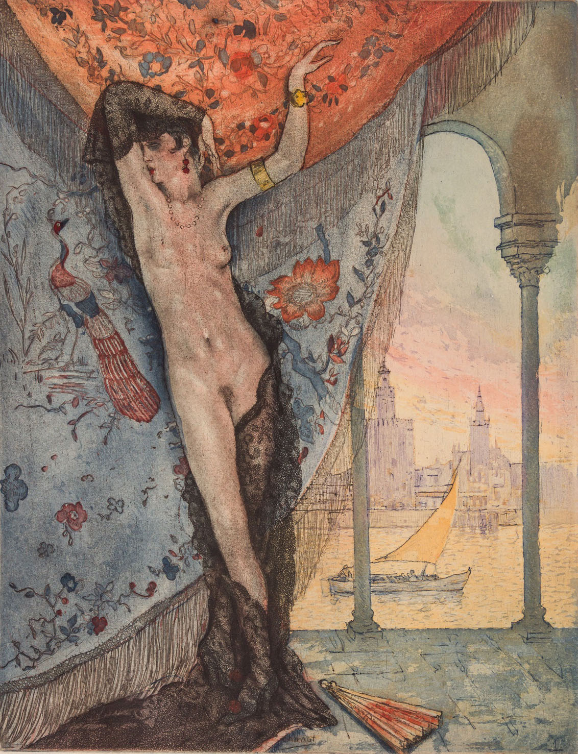
![Gabriele D'Annunzio. Triomphe de la Mort. Paris: Javal et Bourdeaux, [1932]. With 12 illustrations by Beltran Masses, engraved on copper by Mazelin.](https://unregardoblique.com/wp-content/uploads/2023/01/ill-by-beltran-masses-for-gabriele-dannunzio.-triomphe-de-la-mort.-paris-javal-et-bourdeaux-1932.jpg)
![Gabriele D'Annunzio. Triomphe de la Mort. Paris: Javal et Bourdeaux, [1932]. With 12 illustrations by Beltran Masses, engraved on copper by Mazelin. | src liveauctioneers](https://live.staticflickr.com/65535/52639821556_25b95884e0_o.png)
![Gabriele D'Annunzio. Triomphe de la Mort. Paris: Javal et Bourdeaux, [1932]. With 12 illustrations by Beltran Masses, engraved on copper by Mazelin. | src liveauctioneers](https://live.staticflickr.com/65535/52640075729_97f3d6bc06_o.jpg)
![Gabriele D'Annunzio. Triomphe de la Mort. Paris: Javal et Bourdeaux, [1932]. With 12 illustrations by Beltran Masses, engraved on copper by Mazelin. | src liveauctioneers](https://live.staticflickr.com/65535/52640254845_e33294b5f5_o.png)
